The plot2() function is a convenient wrapper around many ggplot2 functions. By design, the ggplot2 package requires users to use a lot of functions and manual settings, while the plot2() function does all the heavy lifting automatically and only requires users to define some arguments in one single function, greatly increases convenience.
Moreover, plot2() allows for in-place calculation of y, all axes, and all axis labels, often preventing the need to use group_by(), count(), mutate(), or summarise().
See plot2-methods for all implemented methods for different object classes.
Usage
plot2(
  .data,
  x = NULL,
  y = NULL,
  category = NULL,
  facet = NULL,
  type = NULL,
  x.title = TRUE,
  y.title = TRUE,
  category.title = NULL,
  title = NULL,
  subtitle = NULL,
  caption = NULL,
  tag = NULL,
  title.linelength = 60,
  title.colour = getOption("plot2.colour_font_primary", "black"),
  subtitle.linelength = 60,
  subtitle.colour = getOption("plot2.colour_font_secondary", "grey35"),
  na.replace = "",
  na.rm = FALSE,
  facet.position = "top",
  facet.fill = NULL,
  facet.bold = TRUE,
  facet.italic = FALSE,
  facet.size = 10,
  facet.margin = 8,
  facet.repeat_lbls_x = TRUE,
  facet.repeat_lbls_y = NULL,
  facet.fixed_y = NULL,
  facet.fixed_x = NULL,
  facet.drop = FALSE,
  facet.nrow = NULL,
  facet.relative = FALSE,
  x.date_breaks = NULL,
  x.date_labels = NULL,
  x.date_remove_years = NULL,
  category.focus = NULL,
  colour = getOption("plot2.colour", "ggplot2"),
  colour_fill = NULL,
  colour_opacity = 0,
  x.lbl_angle = 0,
  x.lbl_align = NULL,
  x.lbl_italic = FALSE,
  x.lbl_taxonomy = FALSE,
  x.remove = FALSE,
  x.position = "bottom",
  x.max_items = Inf,
  x.max_txt = "(rest, x%n)",
  category.max_items = Inf,
  category.max_txt = "(rest, x%n)",
  facet.max_items = Inf,
  facet.max_txt = "(rest, x%n)",
  x.breaks = NULL,
  x.n_breaks = NULL,
  x.transform = "identity",
  x.expand = NULL,
  x.limits = NULL,
  x.labels = NULL,
  x.character = NULL,
  x.drop = FALSE,
  x.mic = FALSE,
  x.zoom = FALSE,
  y.remove = FALSE,
  y.24h = FALSE,
  y.age = FALSE,
  y.scientific = NULL,
  y.percent = FALSE,
  y.percent_break = 0.1,
  y.breaks = NULL,
  y.n_breaks = NULL,
  y.limits = NULL,
  y.labels = NULL,
  y.expand = NULL,
  y.transform = "identity",
  y.position = "left",
  y.zoom = FALSE,
  y_secondary = NULL,
  y_secondary.type = type,
  y_secondary.title = TRUE,
  y_secondary.colour = colour,
  y_secondary.colour_fill = colour_fill,
  y_secondary.scientific = NULL,
  y_secondary.percent = FALSE,
  y_secondary.labels = NULL,
  category.type = "colour",
  category.labels = NULL,
  category.percent = FALSE,
  category.breaks = NULL,
  category.limits = NULL,
  category.expand = 0,
  category.midpoint = NULL,
  category.transform = "identity",
  category.date_breaks = NULL,
  category.date_labels = NULL,
  category.character = NULL,
  x.sort = NULL,
  category.sort = TRUE,
  facet.sort = TRUE,
  x.complete = NULL,
  category.complete = NULL,
  facet.complete = NULL,
  datalabels = TRUE,
  datalabels.round = ifelse(y.percent, 2, 1),
  datalabels.format = "%n",
  datalabels.colour = "grey25",
  datalabels.colour_fill = NULL,
  datalabels.size = (3 * text_factor),
  datalabels.angle = 0,
  datalabels.lineheight = 1,
  decimal.mark = dec_mark(),
  big.mark = big_mark(),
  summarise_function = base::sum,
  stacked = FALSE,
  stacked_fill = FALSE,
  horizontal = FALSE,
  reverse = horizontal,
  smooth = NULL,
  smooth.method = NULL,
  smooth.formula = NULL,
  smooth.se = TRUE,
  smooth.level = 0.95,
  smooth.alpha = NULL,
  smooth.linewidth = NULL,
  smooth.linetype = NULL,
  smooth.colour = NULL,
  size = NULL,
  linetype = 1,
  linewidth = NULL,
  binwidth = NULL,
  width = NULL,
  jitter_seed = NA,
  violin_scale = "count",
  legend.position = NULL,
  legend.title = NULL,
  legend.reverse = FALSE,
  legend.nrow = NULL,
  legend.barheight = 6,
  legend.barwidth = 1.5,
  legend.nbin = 300,
  legend.italic = FALSE,
  sankey.node_width = 0.15,
  sankey.node_whitespace = 0.03,
  sankey.alpha = 0.5,
  sankey.remove_axes = NULL,
  zoom = FALSE,
  sep = " / ",
  print = FALSE,
  text_factor = getOption("plot2.text_factor", 1),
  font = getOption("plot2.font"),
  theme = getOption("plot2.theme", "theme_minimal2"),
  background = getOption("plot2.colour_background", "white"),
  markdown = TRUE,
  data = NULL,
  ...
)
Arguments
- .data
Data to plot.
- x
Plotting 'direction' for the X-axis. This can be:
A single variable from
.data, such asx = column1A function to calculate over one or more variables from
.data, such asx = format(column1, "%Y"), orx = ifelse(column1 == "A", "Group A", "Other")Multiple variables from
.data, such asx = c(column1, column2, column2), or using selection helpers such asx = where(is.character)orx = starts_with("var_")(only allowed and required for Sankey plots usingtype = "sankey")
- y
Values to use for plotting along the Y-axis. This can be:
A single variable from
.data, such asy = column1Multiple variables from
.data, such asy = c(column1, column2)ory = c(name1 = column1, "name 2" = column2), or using selection helpers such asy = where(is.double)ory = starts_with("var_")(multiple variables only allowed ifcategoryis not set)A function to calculate over
.datareturning a single value, such asy = n()for the row count, or based on other variables such asy = n_distinct(person_id),y = max(column1), ory = median(column2) / column3A function to calculate over
.datareturning multiple values, such asy = quantile(column1, c(0.25, 0.75))ory = range(age)(multiple values only allowed ifcategoryis not set)
- category, facet
Plotting 'direction' (
categoryis called 'fill' and 'colour' inggplot2). This can be:A single variable from
.data, such ascategory = column1A function to calculate over one or more variables from
.data, such ascategory = median(column2) / column3, orfacet = ifelse(column1 == "A", "Group A", "Other")Multiple variables from
.data, such asfacet = c(column1, column2)(usesepto control the separator character)One or more variables from
.datausing selection helpers, such ascategory = where(is.double)orfacet = starts_with("var_")
The
categorycan also be a date or date/time (classDateorPOSIXt).- type
Type of visualisation to use. This can be:
A
ggplot2geom name or their abbreviation such as"col"and"point". All geoms are supported (includinggeom_blank()).Full function names can be used (e.g.,
"geom_histogram"), but they can also be abbreviated (e.g.,"h","hist"). The following geoms can be abbreviated by their first character: area ("a"), boxplot ("b"), beeswarm ("bs"), column ("c"), histogram ("h"), jitter ("j"), line ("l"), point ("p"), ribbon ("r"), and violin ("v").Please note: in
ggplot2, 'bars' and 'columns' are equal, while it is common to many people that 'bars' are oriented horizontally and 'columns' are oriented vertically since Microsoft Excel has been using these terms this way for many years. For this reason,type = "bar"will settype = "col"andhorizontal = TRUE.One of these additional types:
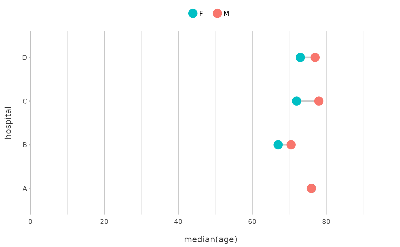
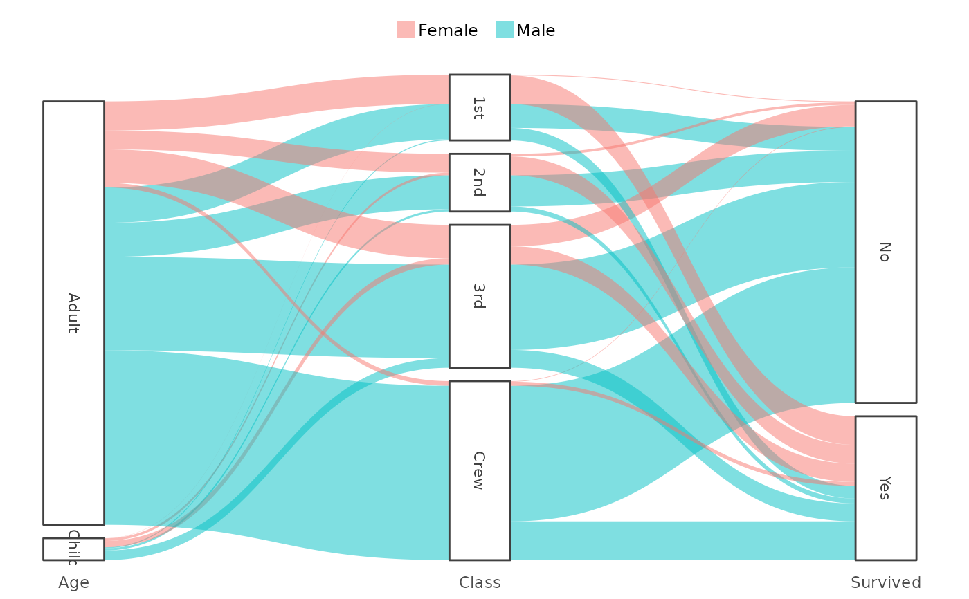
"barpercent"(short:"bp"), which is effectively a shortcut to settype = "col"andhorizontal = TRUEandx.max_items = 10andx.sort = "freq-desc"anddatalabels.format = "%n (%p)"."dumbbell"(short:"d"), which setstype = "point"andhorizontal = TRUE, and adds a line between the points (usinggeom_segment()). The line colour cannot be changed. This plot type is only possible when thecategoryhas two distinct values."linedot"(short:"ld"), which setstype = "line"and adds two point geoms usingadd_point(); one with large white dots and one with smaller dots using the colours set incolour. This is essentially equal to base Rplot(..., type = "b")but with closed shapes."back-to-back"(short:"b2b") creates a back-to-back plot, sometimes called a Tornado diagram, a Butterfly plot, or a Population Pyramid. It usesfacetto distinquish the left and right plots. Therefore,facetmust be set to (a column containing) two unique values."upset"or"UpSet"(short:"u") creates an UpSet plot, which requiresxto contain multiple variables from.datathat contain0/1orFALSE/TRUEvalues. It is also possible to providey, on which thensummarise_functionwill be applied."sankey"(short:"s") creates a Sankey plot usingcategoryfor the flows and requiresxto contain multiple variables from.data. At default, it also setsx.expand = c(0.05, 0.05)andy.limits = c(NA, NA)andy.expand = c(0.01, 0.01). The so-called 'nodes' (the 'blocks' with text) are considered the datalabels, so you can set the text size and colour of the nodes usingdatalabels.size,datalabels.colour, anddatalabels.colour_fill. The transparency of the flows can be set usingsankey.alpha, and the width of the nodes can be set usingsankey.node_width. Sankey plots can also be flipped usinghorizontal = TRUE, and the label angles can be set withdatalabels.angle."spider"or"radar"(short:"sp") creates a Spider plot using our novelCoordSpidercoordinate system.
Left blank. In this case, the type will be determined automatically:
"boxplot"if there is no X-axis or if the length of unique values per X-axis item is at least 3,"point"if both the y and x axes are numeric, and the option"plot2.default_type"otherwise (which defaults to"col"). Usetype = "blank"ortype = "geom_blank"to not add a geom.
- title, subtitle, caption, tag, x.title, y.title, category.title, legend.title, y_secondary.title
A title to use. This can be:
A character, which supports markdown by using
md_to_expression()internally ifmarkdown = TRUE(which is the default)A function to calculate over
.data, such astitle = paste("Based on n =", n_distinct(person_id), "individuals")orsubtitle = paste("Total rows:", n()), see ExamplesAn expression, e.g. using
parse(text = "...")
The
category.titledefaults toTRUEif the legend items are numeric.- title.linelength
Maximum number of characters per line in the title, before a linebreak occurs.
- title.colour
Text colour of the title.
- subtitle.linelength
Maximum number of characters per line in the subtitle, before a linebreak occurs.
- subtitle.colour
Text colour of the subtitle.
- na.replace
Character to put in place of
NAvalues ifna.rm = FALSE.- na.rm
Remove
NAvalues from showing in the plot.- facet.position, facet.fill, facet.bold, facet.italic, facet.size, facet.margin, facet.repeat_lbls_x, facet.repeat_lbls_y, facet.drop, facet.nrow, facet.relative
Additional settings for the plotting direction
facet.- facet.fixed_y
A logical to indicate whether all y scales should have the same limits. Defaults to
TRUEonly if the coefficient of variation (standard deviation divided by mean) of the maximum values of y is less than 25%.- facet.fixed_x
A logical to indicate whether all x scales should have the same breaks. This acts like the inverse of
x.drop.- x.date_breaks
Breaks to use when the X-axis contains dates, will be determined automatically if left blank. This accepts values such as
"1 day"and"2 years".- x.date_labels
Labels to use when the X-axis contains dates, will be determined automatically if left blank. This accepts 'Excel' date-language such as
"d mmmm yyyy".- x.date_remove_years
A logical to indicate whether the years of all
xvalues must be unified. This will set the years of allxvalues to 1970 if the data does not contain a leap year, and to 1972 otherwise. This allows to plot years on thecategorywhile maintaining a date range onx. The default isFALSE, unlesscategorycontains all years present inx.- category.focus
A value of
categorythat should be highlighted, meaning that all other values incategorywill be greyed out. This can also be a numeric value between 1 and the length of unique values ofcategory, e.g.category.focus = 2to focus on the second legend item.- colour
Get_colour(s) to set, will be evaluated with
get_colour()if set. This can also be one of the viridis colours with automatic implementation for any plot:"viridis","magma","inferno","plasma","cividis","rocket","mako"or"turbo". Also, this can be a named vector to match values ofcategory, see Examples. Using a named vector can be used to manually sort the values ofcategory.- colour_fill
Get_colour(s) to be used for filling, will be determined automatically if left blank and will be evaluated with
get_colour().- colour_opacity
Amount of opacity for
colour/colour_fill(0 = solid, 1 = transparent).- x.lbl_angle
Angle to use for the X-axis in a counter-clockwise direction (i.e., a value of
90will orient the axis labels from bottom to top, a value of270will orient the axis labels from top to bottom).- x.lbl_align
Alignment for the X-axis between
0(left aligned) and1(right aligned).- x.lbl_italic
logical to indicate whether the x labels should in in italics.
- x.lbl_taxonomy
A logical to transform all words of the
xlabels into italics that are in the microorganisms data set of theAMRpackage. This usesmd_to_expression()internally and will setx.labelsto parse expressions.- x.remove, y.remove
A logical to indicate whether the axis labels and title should be removed.
- x.position, y.position
Position of the axis.
- x.max_items, category.max_items, facet.max_items
Number of maximum items to use, defaults to infinite. All other values will be grouped and summarised using the
summarise_functionfunction. Please note: the sorting will be applied first, allowing to e.g. plot the top n most frequent values of the X-axis by combiningx.sort = "freq-desc"withx.max_items =n.- x.max_txt, category.max_txt, facet.max_txt
The text to use of values not included number of
*.max_items. The placeholder%nwill be replaced with the outcome of thesummarise_functionfunction, the placeholder%pwill be replaced with the percentage.- x.breaks, y.breaks
A breaks function or numeric vector to use for the axis.
- x.n_breaks, y.n_breaks
Number of breaks, only useful if
x.breakscq.y.breaksisNULL.- x.transform, y.transform, category.transform
A transformation function to use, e.g.
"log2". This can be:"asinh","asn","atanh","boxcox","compose","date","exp","hms","identity","log","log10","log1p","log2","logit","modulus","probability","probit","pseudo_log","reciprocal","reverse","sqrt","time","timespan","yj".- x.expand, y.expand
expansion to use for the axis, can be length 1 or 2.
x.expanddefaults to 0.5 andy.expanddefaults to0.25, except for sf objects (then both default to 0).- x.limits, y.limits
Limits to use for the axis, can be length 1 or 2. Use
NAfor the highest or lowest value in the data, e.g.y.limits = c(0, NA)to have the y scale start at zero.- x.labels, y.labels, y_secondary.labels
A labels function or character vector to use for the axis.
- x.character
A logical to indicate whether the values of the X-axis should be forced to character. The default is
FALSE, except for years (values between 2000 and 2050) and months (values from 1 to 12).- x.drop
logical to indicate whether factor levels should be dropped.
- x.mic
logical to indicate whether the X-axis should be formatted as MIC values, by dropping all factor levels and adding missing factors of 2.
- x.zoom, y.zoom
A logical to indicate if the axis should be zoomed on the data, by setting
x.limits = c(NA, NA)andx.expand = 0for the X-axis, ory.limits = c(NA, NA)andy.expand = 0for the Y-axis.- y.24h
a logical to indicate whether the y labels and breaks should be formatted as 24-hour sequences
- y.age
A logical to indicate whether the y labels and breaks should be formatted as ages in years.
- y.scientific, y_secondary.scientific
A logical to indicate whether the y labels should be formatted in scientific notation. Defaults to
TRUEonly if the range of the y values spans more than10e5.- y.percent, y_secondary.percent
A logical to indicate whether the y labels should be formatted as percentages.
- y.percent_break
A value on which the Y-axis should have breaks.
- y_secondary
Values to use for plotting along the secondary Y-axis. This functionality is poorly supported by
ggplot2and might give unexpected results. Setting the secondary Y-axis will set the colour to the axis titles.- y_secondary.type
see
type- y_secondary.colour, y_secondary.colour_fill
Colours to set for the secondary Y-axis, will be evaluated with
get_colour().- category.type
Type of the
category, one or more of:"colour"(default),"shape","size","linetype","linewidth","alpha". There is no need to set"fill", asplot2handles colour-setting internally and determines automatically whether thecolourorfillaesthetic must be used.- category.labels, category.percent, category.breaks, category.expand, category.midpoint
Settings for the plotting direction
category.- category.limits
Limits to use for a numeric category, can be length 1 or 2. Use
NAfor the highest or lowest value in the data, e.g.category.limits = c(0, NA)to have the scale start at zero.- category.date_breaks
Breaks to use when the category contains dates, will be determined automatically if left blank. This will be passed on to
seq.Date(by = ...)and thus can be: a number, taken to be in days, or a character string containing one of "day", "week", "month", "quarter" or "year" (optionally preceded by an integer and a space, and/or followed by "s").- category.date_labels
Labels to use when the category contains dates, will be determined automatically if left blank. This accepts 'Excel' date-language such as
"d mmmm yyyy".- category.character
A logical to indicate whether the values of the category should be forced to character. The default is
FALSE, except for years (values between 2000 and 2050) and months (values from 1 to 12).- x.sort, category.sort, facet.sort
Sorting of the plotting direction, defaults to
TRUE, except for continuous values on the X-axis (such as dates and numbers). Applying one of the sorting methods will transform the values to an ordered factor, whichggplot2uses to orient the data. Valid values are:A manual vector of values
TRUE: sort factors on their levels, otherwise sort ascending on alphabet, while maintaining numbers in the text (numeric sort)FALSE: sort according to the order in the dataNULL: do not sort/transform at all"asc"or"alpha": sort asTRUE"desc": sort factors on their reversed levels, otherwise sort descending on alphabet, while maintaining numbers in the text (numeric sort)"order"or"inorder": sort asFALSE"freq"or"freq-desc": sort descending according to the frequencies ofycomputed bysummarise_function(highest value first)"freq-asc": sort ascending according to the frequencies ofycomputed bysummarise_function(lowest value first)
- x.complete, category.complete, facet.complete
A value to complete the data. This makes use of
tidyr::full_seq()andtidyr::complete(). For example, usingx.complete = 0will applydata |> complete(full_seq(x, ...), fill = list(x = 0)). Using valueTRUE(e.g.,x.complete = TRUE) is identical to using value0.- datalabels
Values to show as datalabels, see also
datalabels.format. This can be:Left blank. This will default to the values of
yin column-type plots, or when plotting spatial 'sf' data, the values of the first column. It will print a maximum of 25 labels unlessdatalabels = TRUE.TRUEorFALSEto force or remove datalabelsA function to calculate over
.data, such asdatalabels = paste(round(column1), "\n", column2)
- datalabels.round
Number of digits to round the datalabels, applies to both
"%n"and"%p"for replacement (seedatalabels.format).- datalabels.format
Format to use for datalabels. This can be a function (such as
euros()) or a text. For the text,"%n"will be replaced by the count number, and"%p"will be replaced by the percentage of the total count. Usedatalabels.format = NULLto not transform the datalabels.- datalabels.colour, datalabels.colour_fill, datalabels.size, datalabels.angle, datalabels.lineheight
Settings for the datalabels.
- decimal.mark
Decimal mark, defaults to
dec_mark().- big.mark
Thousands separator, defaults to
big_mark().- summarise_function
A function to use if the data has to be summarised, see Examples. This can also be
NULL, which will be converted tofunction(x) x.- stacked
- stacked_fill
A logical to indicate that values must be filled (i.e., stacked to 100%).
- horizontal
A logical to turn the plot 90 degrees using
coord_flip(). This option also updates some theme options, so that e.g.,x.lbl_italicwill still apply to the original X-axis.- reverse
A logical to reverse the values of
category. Uselegend.reverseto reverse the legend ofcategory.- smooth
A logical to add a smooth. In histograms, this will add the density count as an overlaying line (default:
TRUE). In all other cases, a smooth will be added usinggeom_smooth()(default:FALSE).- smooth.method, smooth.formula, smooth.se, smooth.level, smooth.alpha, smooth.linewidth, smooth.linetype, smooth.colour
Settings for
smooth.- size
Size of the geom. Defaults to
2for geoms point, jitter, and beeswarm;4for a UpSet plots (usingtype = "upset");5for a dumbbell plots (usingtype = "dumbbell");0.75otherwise.- linetype
Linetype of the geom, only suitable for geoms that draw lines. Possible options are:
"solid"(default)"dashed""dotted""dotdash""longdash""twodash"
Both numbers and text are supported, e.g.,
linetype = 2andlinetype = "dashed"yield the same results.- linewidth
Linewidth of the geom, only suitable for geoms that draw lines. Defaults to:
- binwidth
Width of bins (only useful for
geom = "histogram"), can be specified as a numeric value or as a function that calculates width fromx, seegeom_histogram(). It defaults to approx.diff(range(x))divided by 12 to 22 based on the data.- width
Width of the geom. Defaults to
0.66for geoms boxplot, violin and jitter, and to0.5otherwise.- jitter_seed
Seed (randomisation factor) to be set when using
type = "jitter".- violin_scale
Scale to be set when using
type = "violin", can also be set to"area".- legend.position
Position of the legend, must be
"top","right","bottom","left"or"none"(orNAorNULL), can be abbreviated. Defaults to"right"for numericcategoryvalues and 'sf' plots, and"top"otherwise.- legend.reverse, legend.barheight, legend.barwidth, legend.nbin, legend.italic, legend.nrow
Other settings for the legend.
- sankey.node_width
Width of the vertical nodes in a Sankey plot.
- sankey.node_whitespace
Whitespace between the nodes in a Sankey plot.
- sankey.alpha
Alpha of the flows in a Sankey plot.
- sankey.remove_axes
Logical to indicate whether all axes must be removed in a Sankey plot.
- zoom
A logical to indicate if the plot should be scaled to the data, i.e., not having the x and y axes to start at 0. This will set
x.zoom = TRUEandy.zoom = TRUE.- sep
Separator character to use if multiple columns are given to either of the three directions:
x,categoryandfacet, e.g.facet = c(column1, column2).A logical to indicate if the result should be printed instead of just returned.
- text_factor
Text factor to use, which will apply to all texts shown in the plot.
- font
Font (family) to use, can be set with
options(plot2.font = "..."). Can be any installed system font or any of the > 1400 font names from Google Fonts. When using custom fonts in R Markdown, be sure to set the chunk optionfig.showtext = TRUE, otherwise an informative error will be generated.- theme
A valid
ggplot2theme to apply, orNULLto use the defaulttheme_grey(). This argument accepts themes (e.g.,theme_bw()), functions (e.g.,theme_bw) and characters themes (e.g.,"theme_bw"). The default istheme_minimal2(), but can be set withoptions(plot2.theme = "...").- background
The background colour of the entire plot, can also be
NAto remove it. Will be evaluated withget_colour(). Only applies whenthemeis notNULL.- markdown
A logical to turn all labels and titles into plotmath expressions, by converting common markdown language using the
md_to_expression()function (defaults toTRUE).- data
Substitute for
.data, used in formula notation, e.g.,plot2(hp ~ mpg, data = mtcars).- ...
Any argument to give to the geom. This will override automatically-set settings for the geom.
Details
The plot2() function is a convenient wrapper around many ggplot2 functions such as ggplot(), aes(), geom_col(), facet_wrap(), labs(), etc., and provides:
Writing as few lines of codes as possible
Easy plotting in three 'directions':
x(the regular X-axis),category(replaces 'fill' and 'colour') andfacetAutomatic setting of these 'directions' based on the input data
Setting in-place calculations for all plotting directions and even
yEasy way for sorting data in many ways (such as on alphabet, numeric value, frequency, original data order), by setting a single argument for the 'direction':
x.sort,category.sortandfacet.sortEasy limiting values, e.g. by setting
x.max_items = 5orcategory.max_items = 5Markdown support for any title text, with any theme
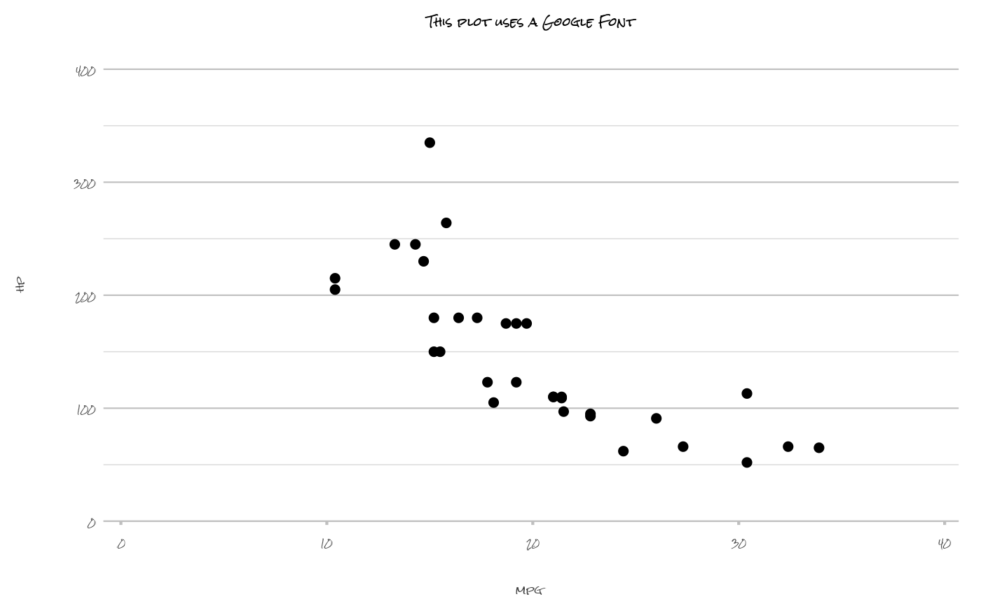
Integrated support for any Google Font and any installed system font
An extra clean, minimalistic theme with a lot of whitespace (but without unnecessary margins) that is ideal for printing:
theme_minimal2()Some conveniences from Microsoft Excel:
The Y-axis starts at 0 if possible
The y scale expands at the top to be better able to interpret all data points
Date breaks can be written in a human-readable format (such as "d mmm yyyy")
Labels with data values can easily be printed and are automatically determined
Support for any
ggplot2extension based onggplot2::fortify()
The ggplot2 package in conjunction with the tidyr, forcats and cleaner packages can provide above functionalities, but the goal of the plot2() function is to generalise this into one function. The generic plot2() function currently has 152 arguments, all with a default value. Less typing, faster coding.
Examples
options(plot2.colour = NULL, plot2.colour_sf_fill = NULL)
head(iris)
#> Sepal.Length Sepal.Width Petal.Length Petal.Width Species
#> 1 5.1 3.5 1.4 0.2 setosa
#> 2 4.9 3.0 1.4 0.2 setosa
#> 3 4.7 3.2 1.3 0.2 setosa
#> 4 4.6 3.1 1.5 0.2 setosa
#> 5 5.0 3.6 1.4 0.2 setosa
#> 6 5.4 3.9 1.7 0.4 setosa
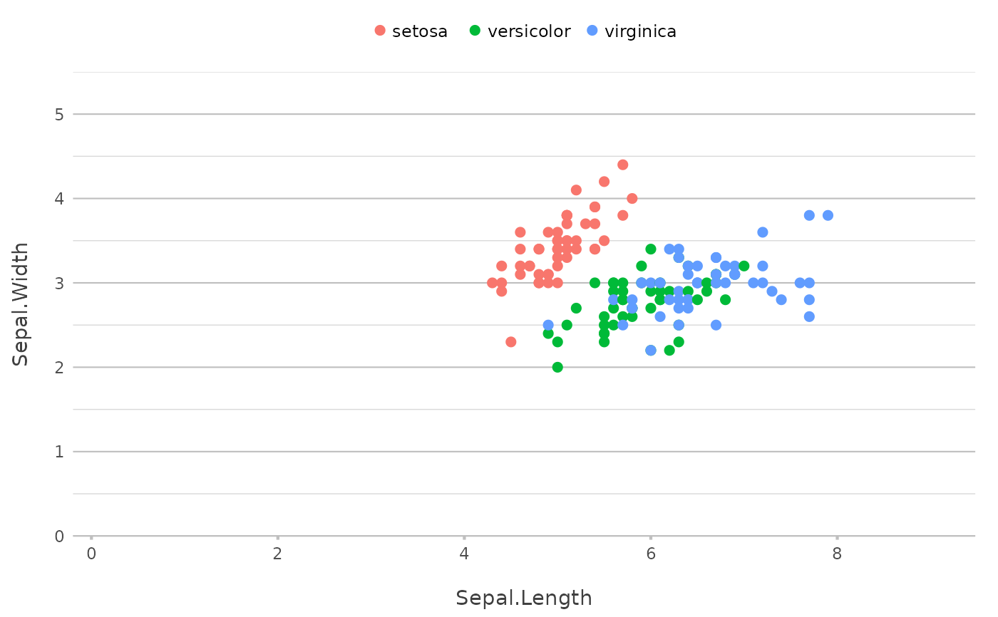
# no variables determined, so plot2() will try for itself -
# the type will be points since the first two variables are numeric
iris |>
plot2()
#> ℹ Using category = Species
#> ℹ Using type = "point" since both axes are numeric
#> ℹ Using x = Sepal.Length
#> ℹ Using y = Sepal.Width
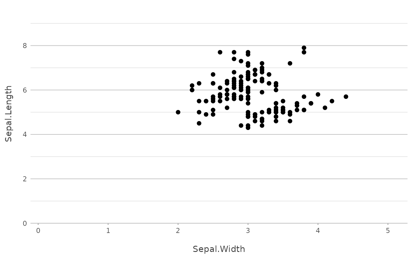
 # if x and y are set, no additional mapping will be set:
iris |>
plot2(Sepal.Width, Sepal.Length)
#> ℹ Using type = "point" since both axes are numeric
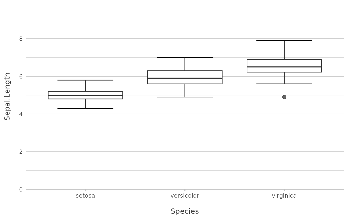
 iris |>
plot2(Species, Sepal.Length)
#> ℹ Using type = "boxplot" since all groups in Species contain at least three
#> values
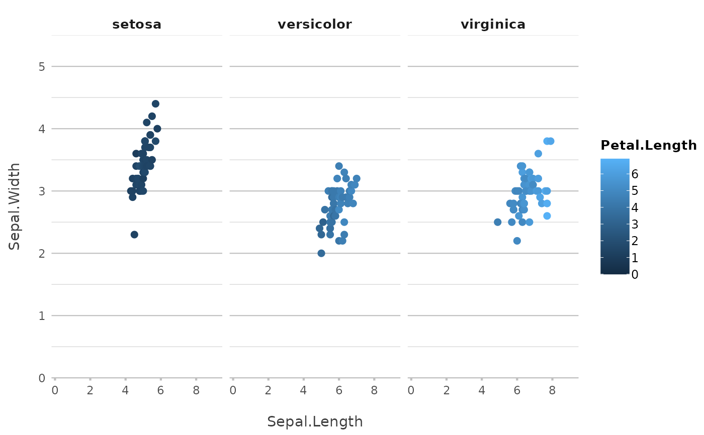
 # the arguments are in this order: x, y, category, facet
iris |>
plot2(Sepal.Length, Sepal.Width, Petal.Length, Species)
#> ℹ Assuming facet.fixed_x = TRUE since the three x scales differ by less than
#> 25%
#> ℹ Assuming facet.fixed_y = TRUE since the three y scales differ by less than
#> 25%
#> ℹ Assuming facet.repeat_lbls_y = FALSE since y has fixed scales
#> ℹ Using type = "point" since both axes are numeric
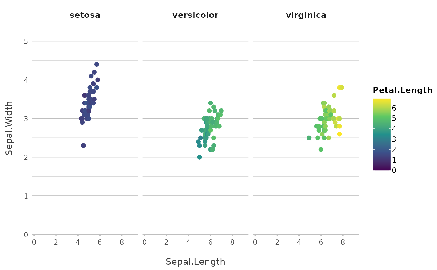
 iris |>
plot2(Sepal.Length, Sepal.Width, Petal.Length, Species,
colour = "viridis") # set the viridis colours
#> ℹ Assuming facet.fixed_x = TRUE since the three x scales differ by less than
#> 25%
#> ℹ Assuming facet.fixed_y = TRUE since the three y scales differ by less than
#> 25%
#> ℹ Assuming facet.repeat_lbls_y = FALSE since y has fixed scales
#> ℹ Using type = "point" since both axes are numeric
 # set your own colours
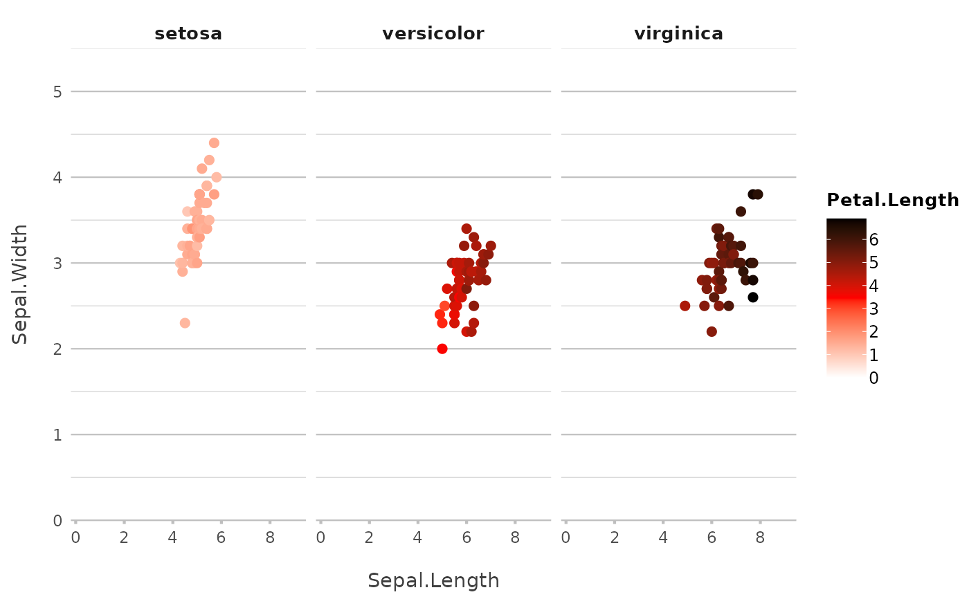
iris |>
plot2(Sepal.Length, Sepal.Width, Petal.Length, Species,
colour = c("white", "red", "black"))
#> ℹ Assuming facet.fixed_x = TRUE since the three x scales differ by less than
#> 25%
#> ℹ Assuming facet.fixed_y = TRUE since the three y scales differ by less than
#> 25%
#> ℹ Assuming facet.repeat_lbls_y = FALSE since y has fixed scales
#> ℹ Using category.midpoint = 3.45 (the current category scale centre)
#> ℹ Using type = "point" since both axes are numeric
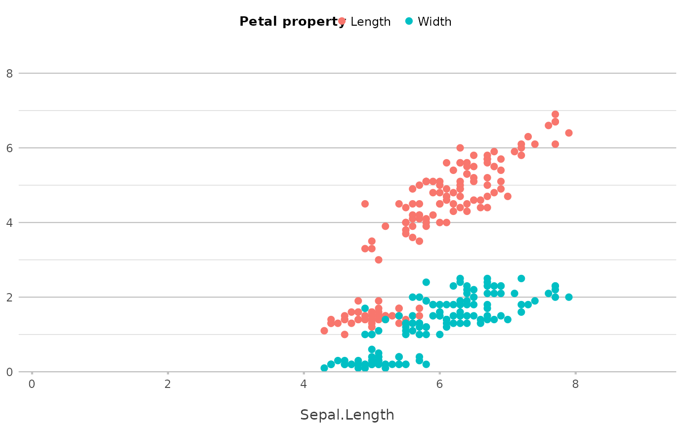
 # y can also be multiple (named) columns
iris |>
plot2(x = Sepal.Length,
y = c(Length = Petal.Length, Width = Petal.Width),
category.title = "Petal property")
#> ℹ Using type = "point" since both axes are numeric
 iris |>
# with included selection helpers such as where(), starts_with(), etc.:
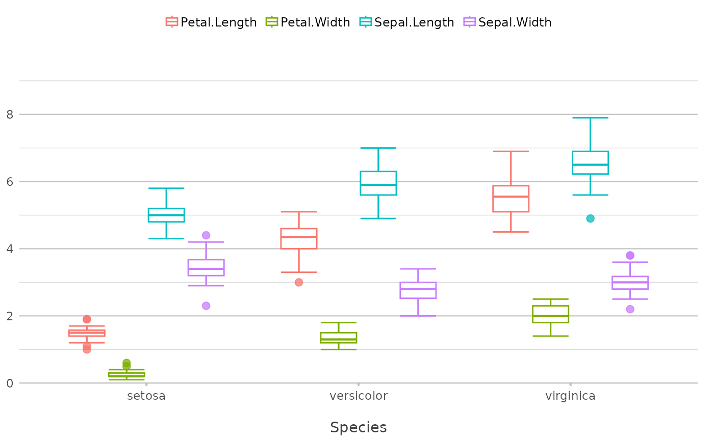
plot2(x = Species, y = where(is.double))
#> ℹ Using type = "boxplot" since all groups in Species and category contain at
#> least three values
#> ℹ Using y = c(Petal.Length, Petal.Width, Sepal.Length, Sepal.Width)
 # the category type can be one or more aesthetics
iris |>
plot2(zoom = TRUE,
category.type = c("colour", "shape"),
size = 3)
#> ℹ Using category = Species
#> ℹ Using type = "point" since both axes are numeric
#> ℹ Using x = Sepal.Length
#> ℹ Using y = Sepal.Width
 iris |>
plot2(zoom = TRUE,
category = Petal.Length,
category.type = c("colour", "size"),
colour = "viridis")
#> ℹ Using type = "point" since both axes are numeric
#> ℹ Using x = Sepal.Length
#> ℹ Using y = Sepal.Width
 # easily add a smooth
iris |>
plot2(zoom = TRUE,
smooth = TRUE)
#> ℹ Using category = Species
#> ℹ Using type = "point" since both axes are numeric
#> ℹ Using x = Sepal.Length
#> ℹ Using y = Sepal.Width
#> `geom_smooth()` using method = 'loess' and formula = 'y ~ x'
 iris |>
plot2(zoom = TRUE,
smooth = TRUE,
smooth.method = "lm")
#> ℹ Using category = Species
#> ℹ Using type = "point" since both axes are numeric
#> ℹ Using x = Sepal.Length
#> ℹ Using y = Sepal.Width
#> `geom_smooth()` using formula = 'y ~ x'
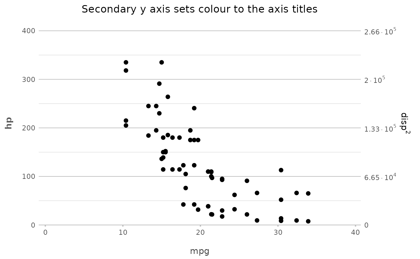
 # support for secondary Y-axis
mtcars |>
plot2(x = mpg,
y = hp,
y_secondary = disp ^ 2,
y_secondary.scientific = TRUE,
title = "Secondary Y-axis sets colour to the axis titles")
#> ℹ Using type = "point" since both axes are numeric
 admitted_patients
#> # A tibble: 250 × 7
#> date patient_id gender age age_group hospital ward
#> <date> <dbl> <chr> <dbl> <ord> <fct> <chr>
#> 1 2002-01-14 1 M 78 75+ D Non-ICU
#> 2 2002-03-17 2 M 78 75+ C Non-ICU
#> 3 2002-04-08 3 M 78 75+ A ICU
#> 4 2002-04-14 4 M 72 55-74 C Non-ICU
#> 5 2002-05-07 5 M 83 75+ C Non-ICU
#> 6 2002-05-16 6 F 65 55-74 B ICU
#> 7 2002-05-16 7 M 47 25-54 D Non-ICU
#> 8 2002-06-18 8 M 30 25-54 B ICU
#> 9 2002-06-23 9 M 82 75+ D Non-ICU
#> 10 2002-06-23 9 M 82 75+ D Non-ICU
#> # ℹ 240 more rows
# the arguments are in this order: x, y, category, facet
admitted_patients |>
plot2(hospital, age)
#> ℹ Using type = "boxplot" since all groups in hospital contain at least three
#> values
admitted_patients
#> # A tibble: 250 × 7
#> date patient_id gender age age_group hospital ward
#> <date> <dbl> <chr> <dbl> <ord> <fct> <chr>
#> 1 2002-01-14 1 M 78 75+ D Non-ICU
#> 2 2002-03-17 2 M 78 75+ C Non-ICU
#> 3 2002-04-08 3 M 78 75+ A ICU
#> 4 2002-04-14 4 M 72 55-74 C Non-ICU
#> 5 2002-05-07 5 M 83 75+ C Non-ICU
#> 6 2002-05-16 6 F 65 55-74 B ICU
#> 7 2002-05-16 7 M 47 25-54 D Non-ICU
#> 8 2002-06-18 8 M 30 25-54 B ICU
#> 9 2002-06-23 9 M 82 75+ D Non-ICU
#> 10 2002-06-23 9 M 82 75+ D Non-ICU
#> # ℹ 240 more rows
# the arguments are in this order: x, y, category, facet
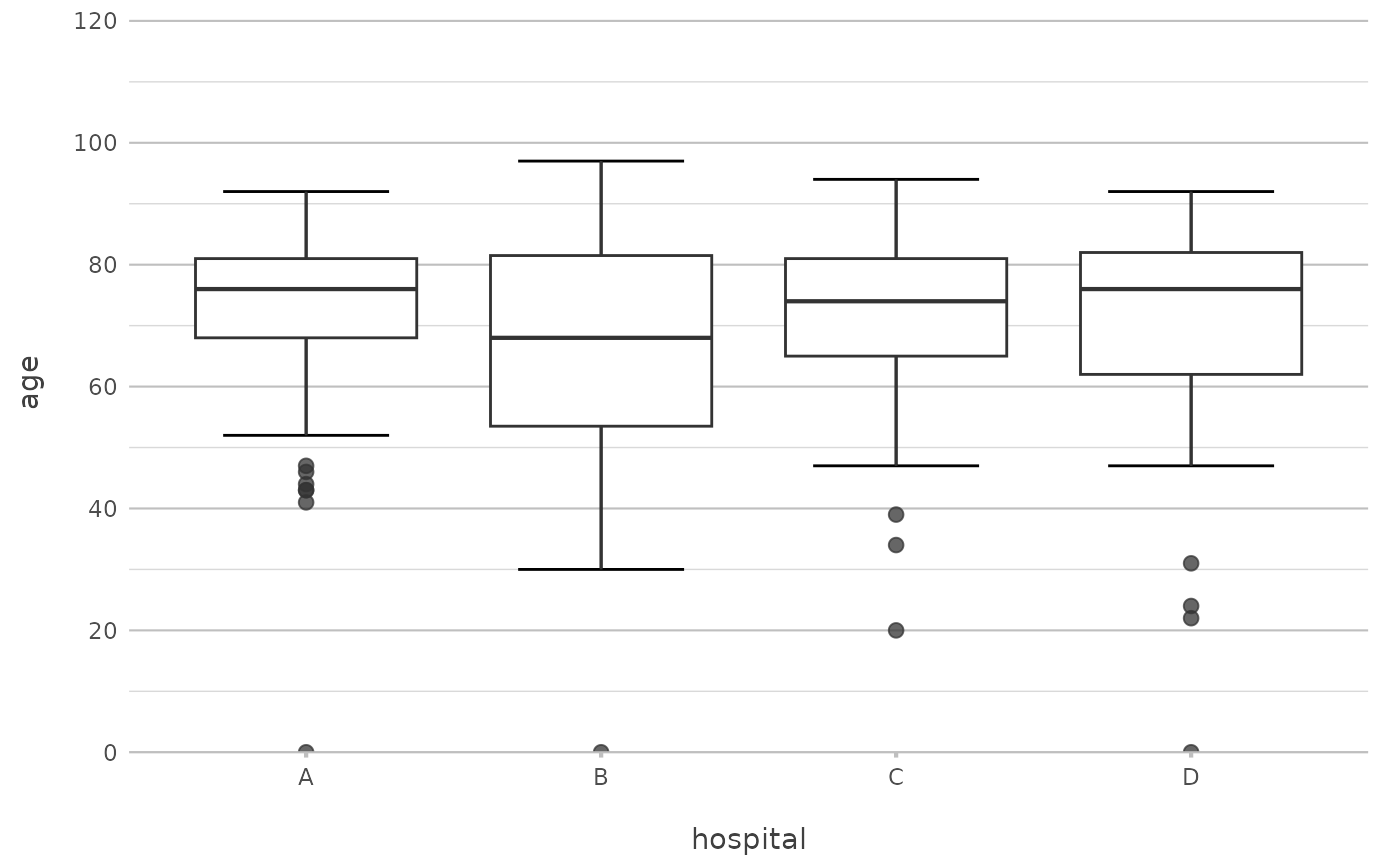
admitted_patients |>
plot2(hospital, age)
#> ℹ Using type = "boxplot" since all groups in hospital contain at least three
#> values
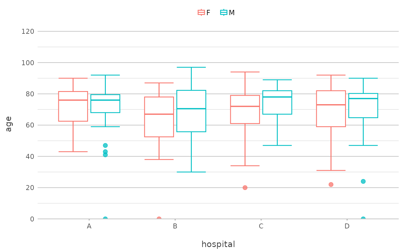
 admitted_patients |>
plot2(hospital, age, gender)
#> ℹ Using type = "boxplot" since all groups in hospital and gender contain at
#> least three values
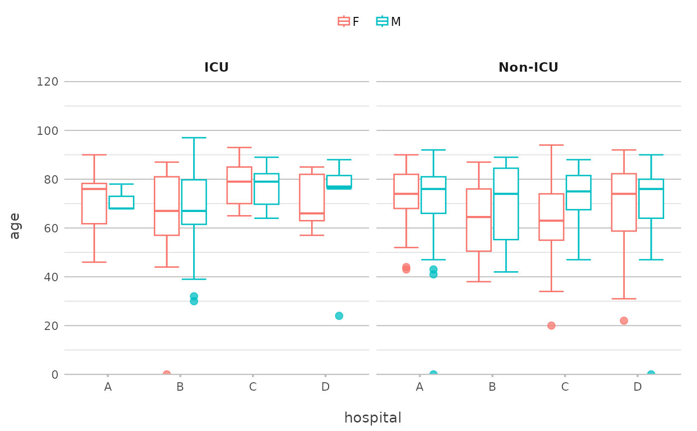
 admitted_patients |>
plot2(hospital, age, gender, ward)
#> ℹ Assuming facet.fixed_y = TRUE since the two y scales differ by less than 25%
#> ℹ Assuming facet.repeat_lbls_y = FALSE since y has fixed scales
#> ℹ Using type = "boxplot" since all groups in hospital and gender and ward
#> contain at least three values
 # or use any function for y
admitted_patients |>
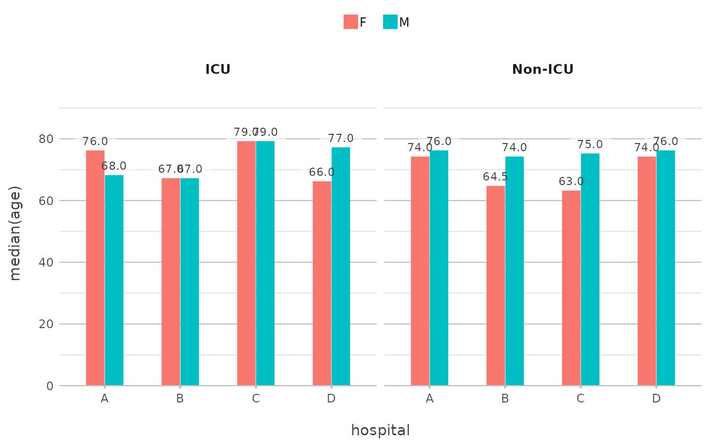
plot2(hospital, median(age), gender, ward)
#> ℹ Assuming facet.fixed_y = TRUE since the two y scales differ by less than 25%
#> ℹ Assuming facet.repeat_lbls_y = FALSE since y has fixed scales
 admitted_patients |>
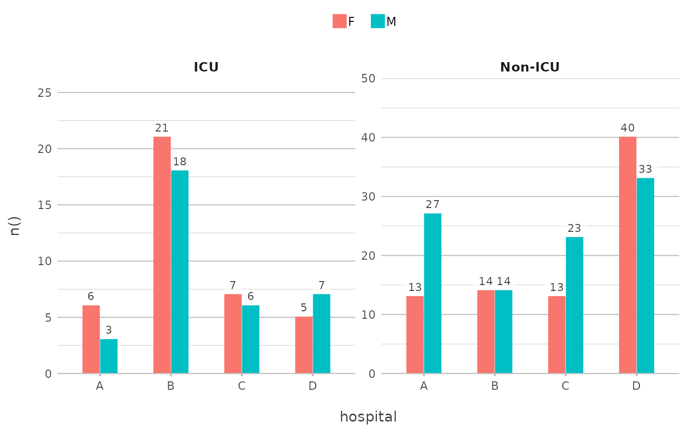
plot2(hospital, n(), gender, ward)
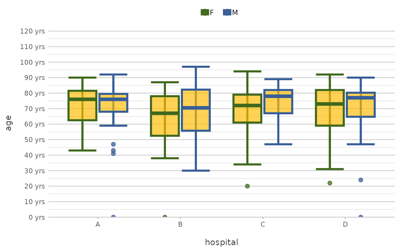
 admitted_patients |>
plot2(x = hospital,
y = age,
category = gender,
colour = c("F" = "#3F681C", "M" = "#375E97"),
colour_fill = "#FFBB00AA",
linewidth = 1.25,
y.age = TRUE)
#> ℹ Using type = "boxplot" since all groups in hospital and gender contain at
#> least three values
 admitted_patients |>
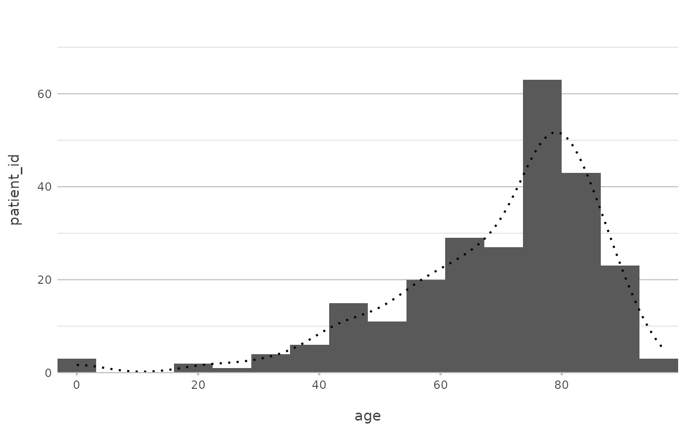
plot2(age, type = "hist")
#> ℹ Assuming smooth = TRUE for type = "histogram"
#> ℹ Using binwidth = 6.4 based on data
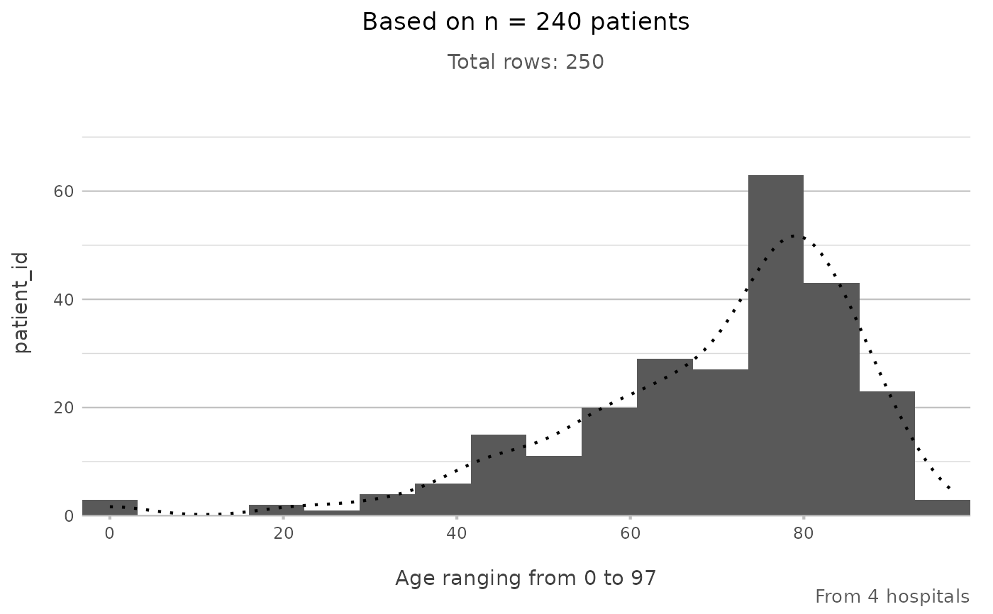
 # even titles support calculations, including support for {glue}
admitted_patients |>
plot2(age, type = "hist",
title = paste("Based on n =", n_distinct(patient_id), "patients"),
subtitle = paste("Total rows:", n()),
caption = glue::glue("From {n_distinct(hospital)} hospitals"),
x.title = paste("Age ranging from", paste(range(age), collapse = " to ")))
#> ℹ Assuming smooth = TRUE for type = "histogram"
#> ℹ Using binwidth = 6.4 based on data
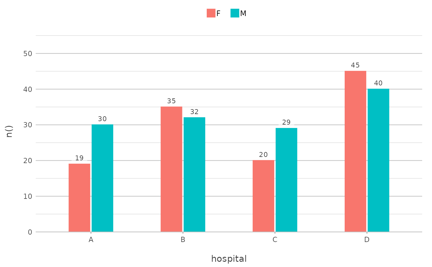
 # the default type is column, datalabels are automatically
# set in non-continuous types:
admitted_patients |>
plot2(hospital, n(), gender)
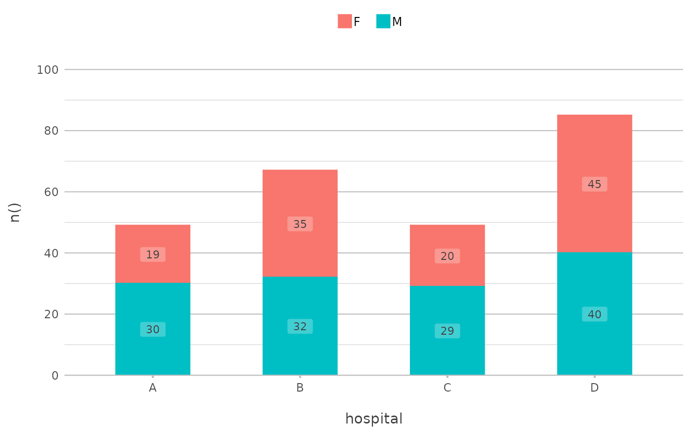
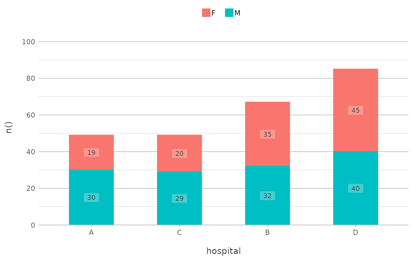 admitted_patients |>
plot2(hospital, n(), gender,
stacked = TRUE)
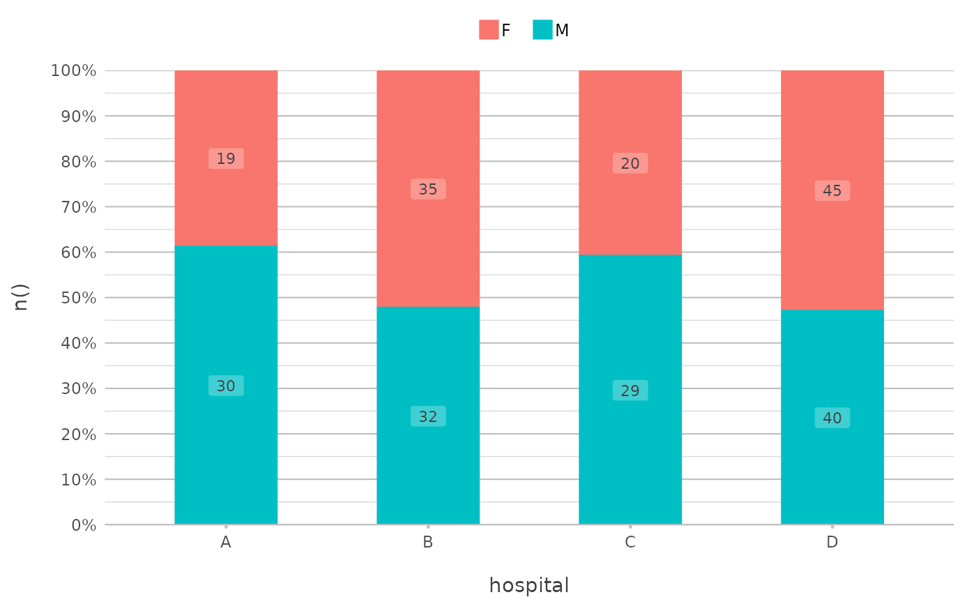
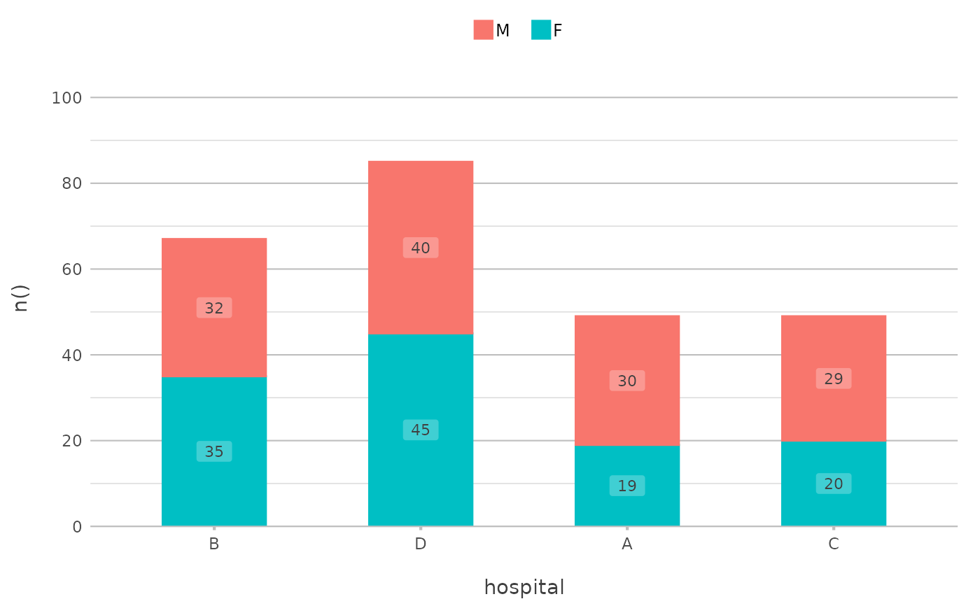 admitted_patients |>
plot2(hospital, n(), gender,
stacked_fill = TRUE)
 # two categories might benefit from a dumbbell plot:
admitted_patients |>
plot2(hospital, median(age), gender, type = "dumbbell")
 # sort on any direction:
admitted_patients |>
plot2(hospital, n(), gender,
x.sort = "freq-asc",
stacked = TRUE)
#> ℹ Applying x.sort = "freq-asc" using summarise_function = sum
 admitted_patients |>
plot2(hospital, n(), gender,
x.sort = c("B", "D", "A"), # missing values ("C") will be added
category.sort = "alpha-desc",
stacked = TRUE)
 # support for Sankey plots
Titanic |> # a table from base R
plot2(x = c(Age, Class, Survived),
category = Sex,
type = "sankey")
#> ℹ Assuming sankey.remove_axes = TRUE
#> ! Input class 'table' was transformed using `as.data.frame()`
 # support for spider plots
ggplot2::diamonds |>
plot2(x = cut,
y = mean(price),
category = color,
type = "spider",
y.labels = dollars)
 # matrix support, such as for cor()
correlation_matrix <- cor(mtcars)
class(correlation_matrix)
#> [1] "matrix" "array"
head(correlation_matrix)
#> mpg cyl disp hp drat wt
#> mpg 1.0000000 -0.8521620 -0.8475514 -0.7761684 0.6811719 -0.8676594
#> cyl -0.8521620 1.0000000 0.9020329 0.8324475 -0.6999381 0.7824958
#> disp -0.8475514 0.9020329 1.0000000 0.7909486 -0.7102139 0.8879799
#> hp -0.7761684 0.8324475 0.7909486 1.0000000 -0.4487591 0.6587479
#> drat 0.6811719 -0.6999381 -0.7102139 -0.4487591 1.0000000 -0.7124406
#> wt -0.8676594 0.7824958 0.8879799 0.6587479 -0.7124406 1.0000000
#> qsec vs am gear carb
#> mpg 0.41868403 0.6640389 0.5998324 0.4802848 -0.5509251
#> cyl -0.59124207 -0.8108118 -0.5226070 -0.4926866 0.5269883
#> disp -0.43369788 -0.7104159 -0.5912270 -0.5555692 0.3949769
#> hp -0.70822339 -0.7230967 -0.2432043 -0.1257043 0.7498125
#> drat 0.09120476 0.4402785 0.7127111 0.6996101 -0.0907898
#> wt -0.17471588 -0.5549157 -0.6924953 -0.5832870 0.4276059
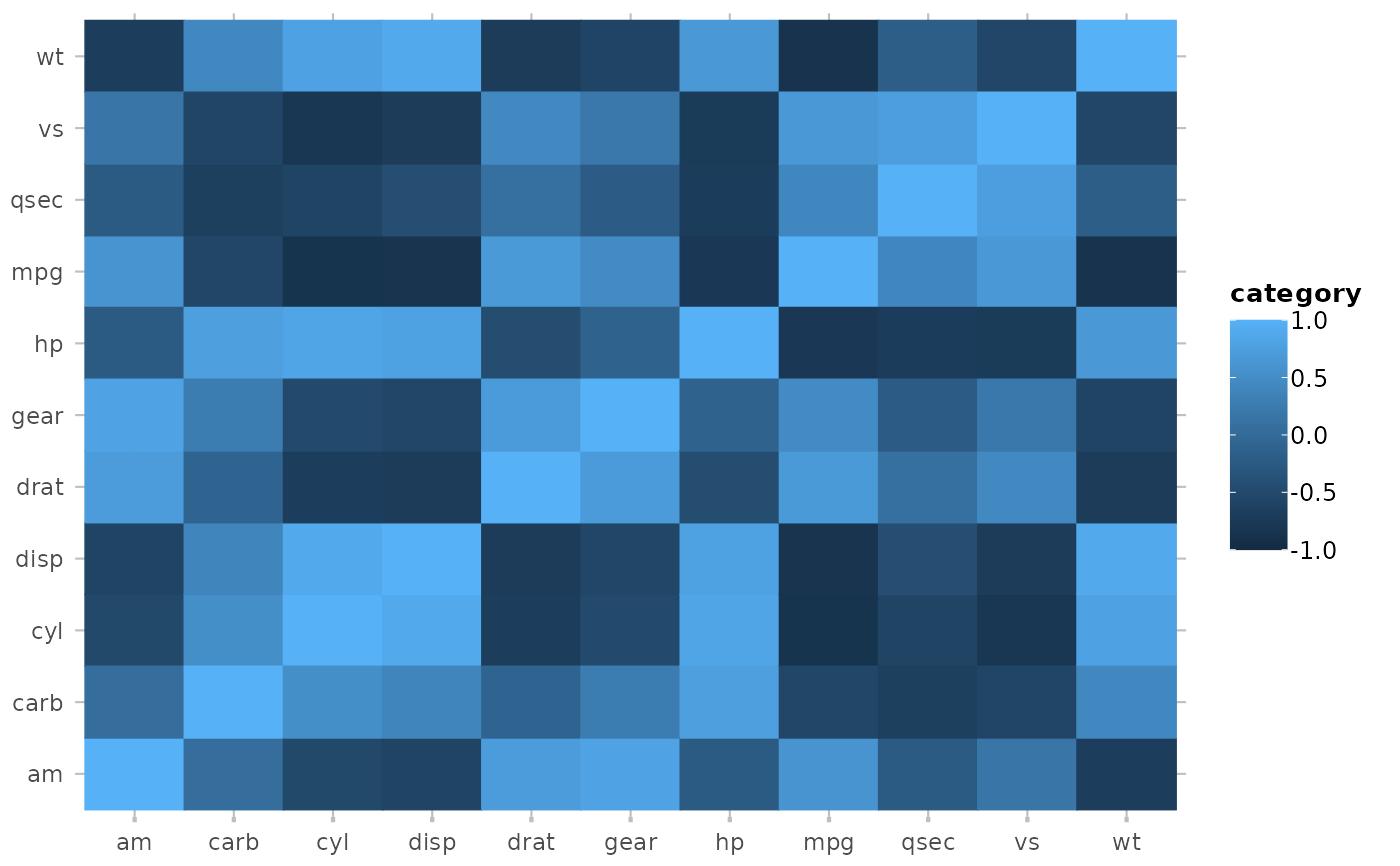
mtcars |>
cor() |>
plot2()
#> ℹ Assuming type = "tile" since the matrix contains identical row and column
#> names
#> ! Omitting printing of 121 datalabels - use datalabels = TRUE to force printing
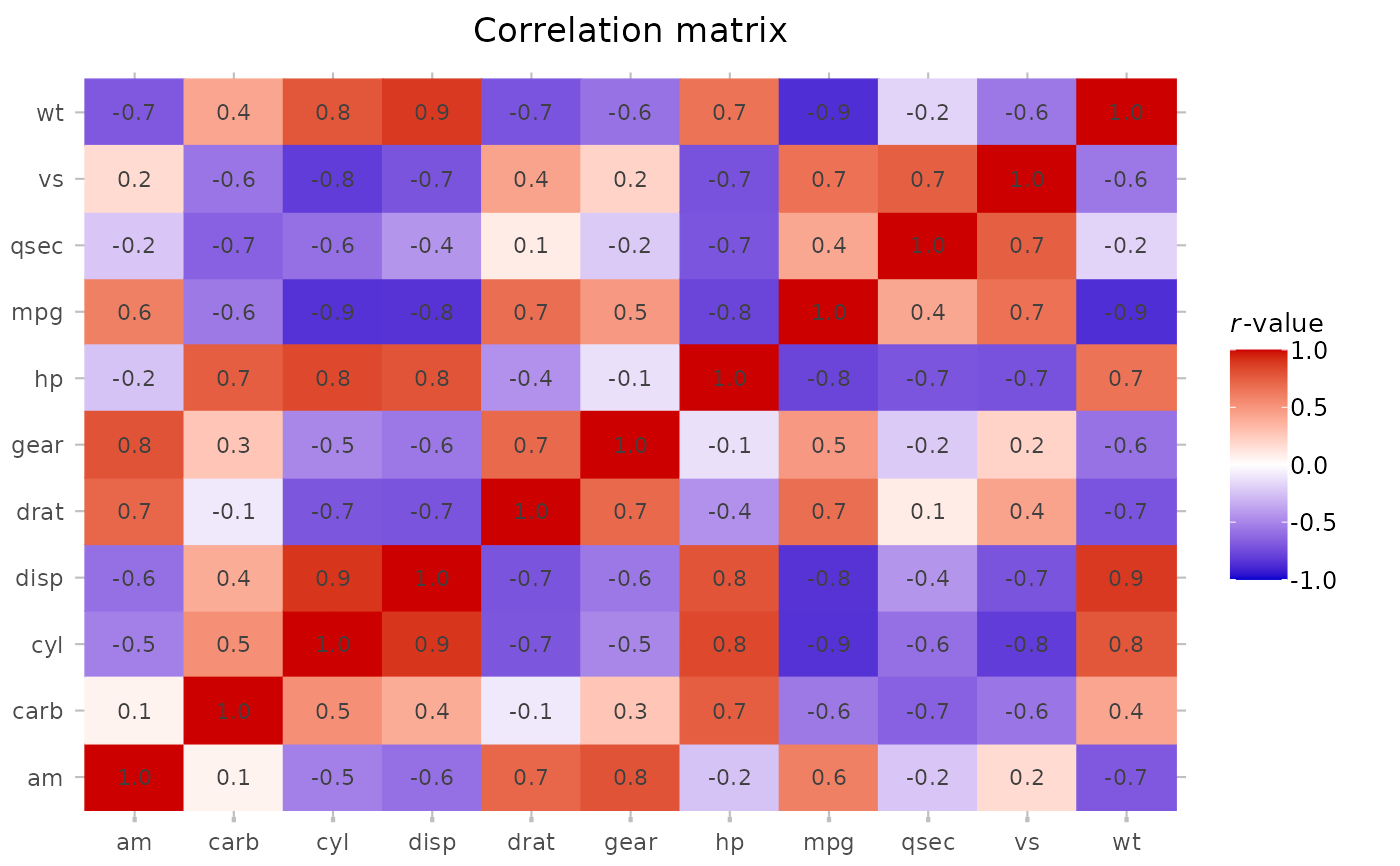
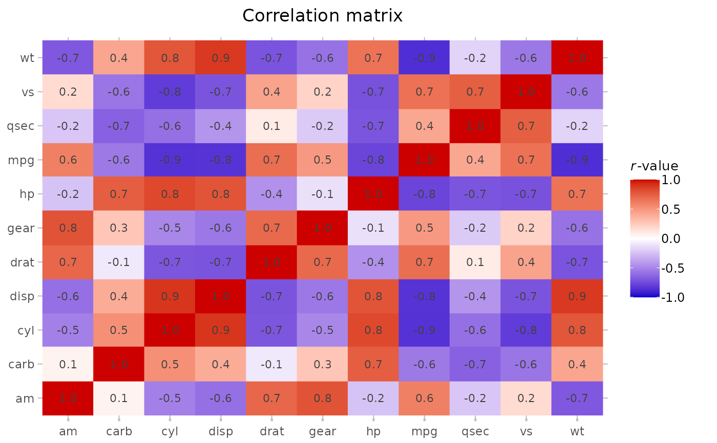 mtcars |>
cor() |>
plot2(colour = c("blue3", "white", "red3"),
datalabels = TRUE,
category.title = "*r*-value",
title = "Correlation matrix")
#> ℹ Assuming type = "tile" since the matrix contains identical row and column
#> names
#> ℹ Using category.midpoint = 0 (the current category scale centre)
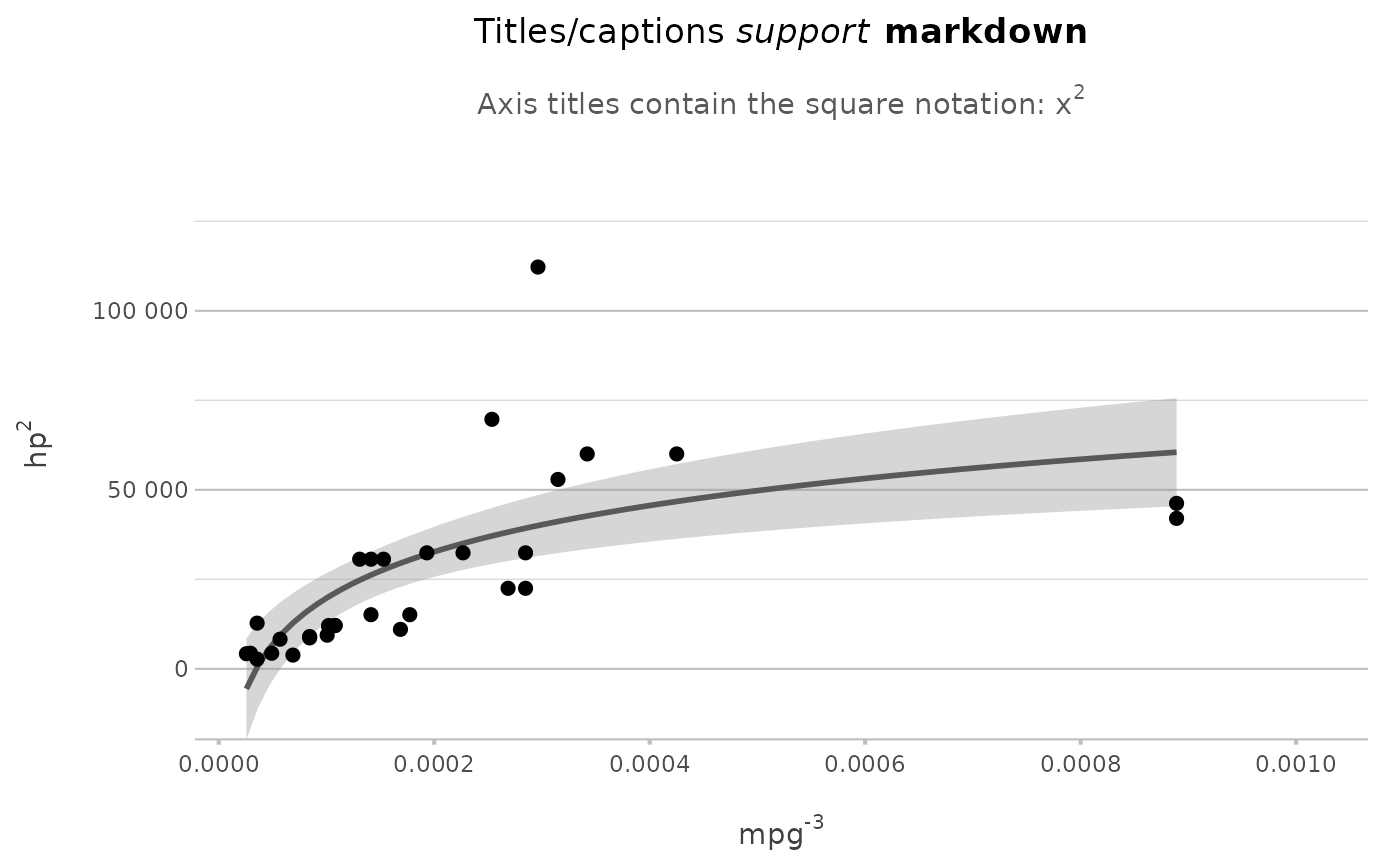 # plot2() supports all S3 extensions available through
# ggplot2::fortify() and broom::augment(), such as regression models:
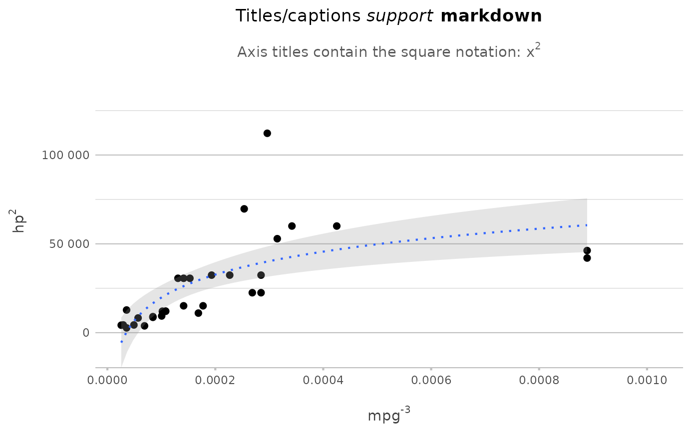
lm(mpg ~ hp, data = mtcars) |>
plot2(x = mpg ^ -3,
y = hp ^ 2,
smooth = TRUE,
smooth.method = "lm",
smooth.formula = "y ~ log(x)",
title = "Titles/captions *support* **markdown**",
subtitle = "Axis titles contain the square notation: x^2")
#> ℹ Using type = "point" since both axes are numeric
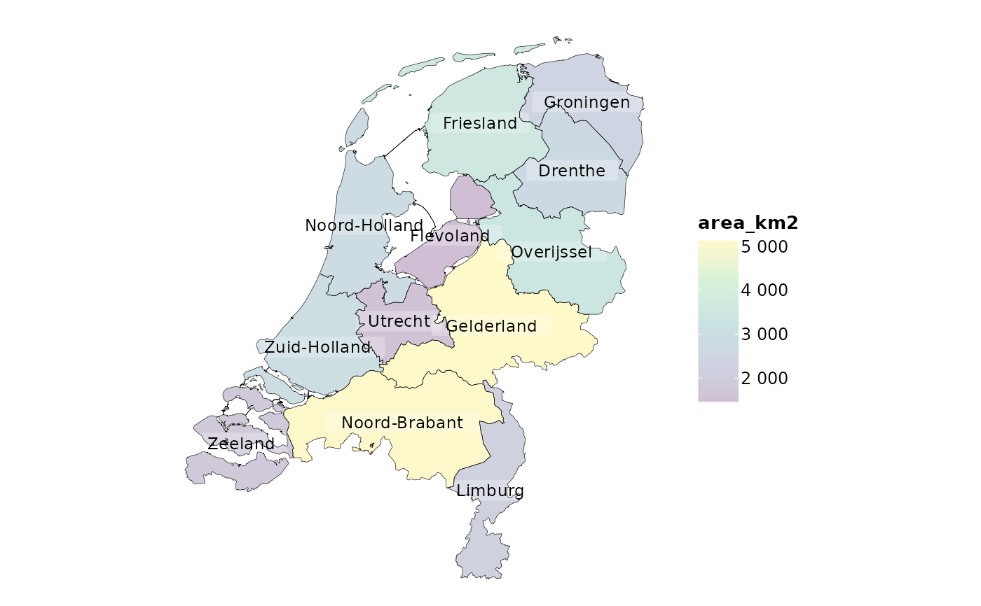
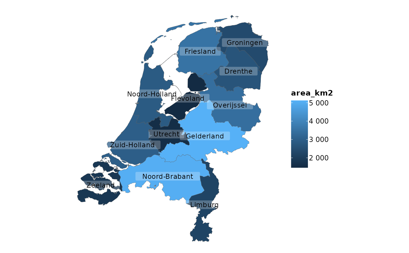 # sf objects (geographic plots, 'simple features') are also supported
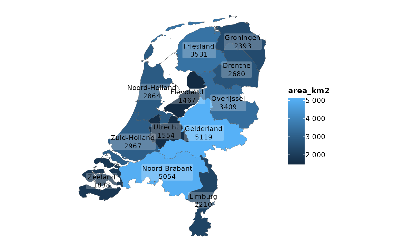
netherlands |>
plot2()
#> ℹ Assuming datalabels.centroid = TRUE. Set to FALSE for a point-on-surface
#> placing of datalabels.
#> ℹ Using category = area_km2
#> ℹ Using datalabels = province
 netherlands |>
plot2(colour_fill = "viridis", colour_opacity = 0.75) |>
add_sf(netherlands, colour = "black", colour_fill = NA)
#> ℹ Assuming datalabels.centroid = TRUE. Set to FALSE for a point-on-surface
#> placing of datalabels.
#> ℹ Using category = area_km2
#> ℹ Using datalabels = province
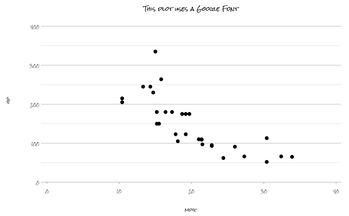 # support for any system or Google font
mtcars |>
plot2(mpg, hp,
font = "Rock Salt",
text_factor = 1.25,
title = "This plot uses a Google Font")
#> ℹ Using type = "point" since both axes are numeric
