Quickly and conveniently add a new 'geom' to an existing plot2/ggplot model. Like plot2(), these functions support tidy evaluation, meaning that variables can be unquoted. Better yet, they can contain any function with any output length, or any vector. They can be added using the pipe (new base R's |> or tidyverse's %>%).
Usage
add_type(plot, type = NULL, mapping = aes(), ..., data = NULL, move = 0)

add_line(
  plot,
  y = NULL,
  x = NULL,
  colour = getOption("plot2.colour", "ggplot2"),
  linetype,
  linewidth,
  ...,
  inherit.aes = NULL,
  move = 0,
  legend.value = NULL
)

add_point(
  plot,
  y = NULL,
  x = NULL,
  colour = getOption("plot2.colour", "ggplot2"),
  size,
  shape,
  ...,
  inherit.aes = NULL,
  move = 0,
  legend.value = NULL
)

add_col(
  plot,
  y = NULL,
  x = NULL,
  colour = getOption("plot2.colour", "ggplot2"),
  colour_fill,
  width,
  ...,
  inherit.aes = NULL,
  move = 0,
  legend.value = NULL
)

add_errorbar(
  plot,
  min,
  max,
  colour = getOption("plot2.colour", "ggplot2"),
  width = 0.5,
  ...,
  inherit.aes = NULL,
  move = 0
)

add_smooth(
  plot,
  y = NULL,
  x = NULL,
  colour = getOption("plot2.colour", "ggplot2"),
  linetype,
  linewidth,
  formula,
  method,
  se,
  ...,
  inherit.aes = NULL,
  move = 0,
  legend.value = NULL
)

add_sf(
  plot,
  sf_data,
  colour = getOption("plot2.colour_sf", "grey50"),
  colour_fill = getOption("plot2.colour_sf_fill", getOption("plot2.colour", "ggplot2")),
  size = 2,
  linewidth = 0.1,
  datalabels = NULL,
  datalabels.colour = "black",
  datalabels.size = 3,
  datalabels.angle = 0,
  datalabels.font = getOption("plot2.font"),
  datalabels.nudge_y = 2500,
  ...,
  inherit.aes = FALSE
)
Arguments
- plot
A
ggplot2plot.- type
A
ggplot2geom name, all geoms are supported. Full function names can be used (e.g.,"geom_line"), but they can also be abbreviated (e.g.,"l","line"). These geoms can be abbreviated by their first character: area ("a"), boxplot ("b"), column ("c"), histogram ("h"), jitter ("j"), line ("l"), point ("p"), ribbon ("r"), violin ("v").- mapping
A mapping created with
aes()to pass on to the geom.- data
Data to use in mapping.
- move
Number of layers to move the newly added geom down, e.g.,
move = 1will place the newly added geom down 1 layer, thus directly under the highest layer.- x, y
aesthetic arguments
- colour, colour_fill
colour of the line or column, will be evaluated with
get_colour(). Ifcolour_fillis missing butcolouris given,colour_fillwill inherit the colour set withcolour.- linetype, linewidth, shape, size, width, ...
Arguments passed on to the geom.
- inherit.aes
A logical to indicate whether the default aesthetics should be inherited, rather than combining with them.
- legend.value
Text to show in an additional legend that will be created. Since
ggplot2does not actually support this, it may give some false-positive warnings or messages, such as "Removed 1 row containing missing values or values outside the scale range".- min, max
minimum (lower) and maximum (upper) values of the error bars
- formula
Formula to use in smoothing function, eg.
y ~ x,y ~ poly(x, 2),y ~ log(x).NULLby default, in which casemethod = NULLimpliesformula = y ~ xwhen there are fewer than 1,000 observations andformula = y ~ s(x, bs = "cs")otherwise.- method
Smoothing method (function) to use, accepts either
NULLor a character vector, e.g."lm","glm","gam","loess"or a function, e.g.MASS::rlmormgcv::gam,stats::lm, orstats::loess."auto"is also accepted for backwards compatibility. It is equivalent toNULL.For
method = NULLthe smoothing method is chosen based on the size of the largest group (across all panels).stats::loess()is used for less than 1,000 observations; otherwisemgcv::gam()is used withformula = y ~ s(x, bs = "cs")withmethod = "REML". Somewhat anecdotally,loessgives a better appearance, but is \(O(N^{2})\) in memory, so does not work for larger datasets.If you have fewer than 1,000 observations but want to use the same
gam()model thatmethod = NULLwould use, then setmethod = "gam", formula = y ~ s(x, bs = "cs").- se
Display confidence band around smooth? (
TRUEby default, seelevelto control.)- sf_data
an 'sf' data.frame
- datalabels
a column of
sf_datato add as label below the points- datalabels.colour, datalabels.size, datalabels.angle, datalabels.font
properties of
datalabels- datalabels.nudge_y
is
datalabelsis notNULL, the amount of vertical adjustment of the datalabels (positive value: more to the North, negative value: more to the South)
Details
The function add_line() will add:
geom_hline()if onlyyis provided and it contains one unique value;geom_vline()if onlyxis provided and it contains one unique value;geom_line()in all other cases.
The function add_errorbar() only adds error bars to the y values, see Examples.
Examples
head(iris)
#> Sepal.Length Sepal.Width Petal.Length Petal.Width Species
#> 1 5.1 3.5 1.4 0.2 setosa
#> 2 4.9 3.0 1.4 0.2 setosa
#> 3 4.7 3.2 1.3 0.2 setosa
#> 4 4.6 3.1 1.5 0.2 setosa
#> 5 5.0 3.6 1.4 0.2 setosa
#> 6 5.4 3.9 1.7 0.4 setosa
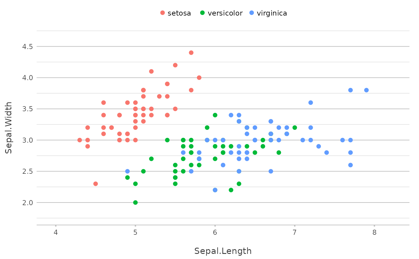
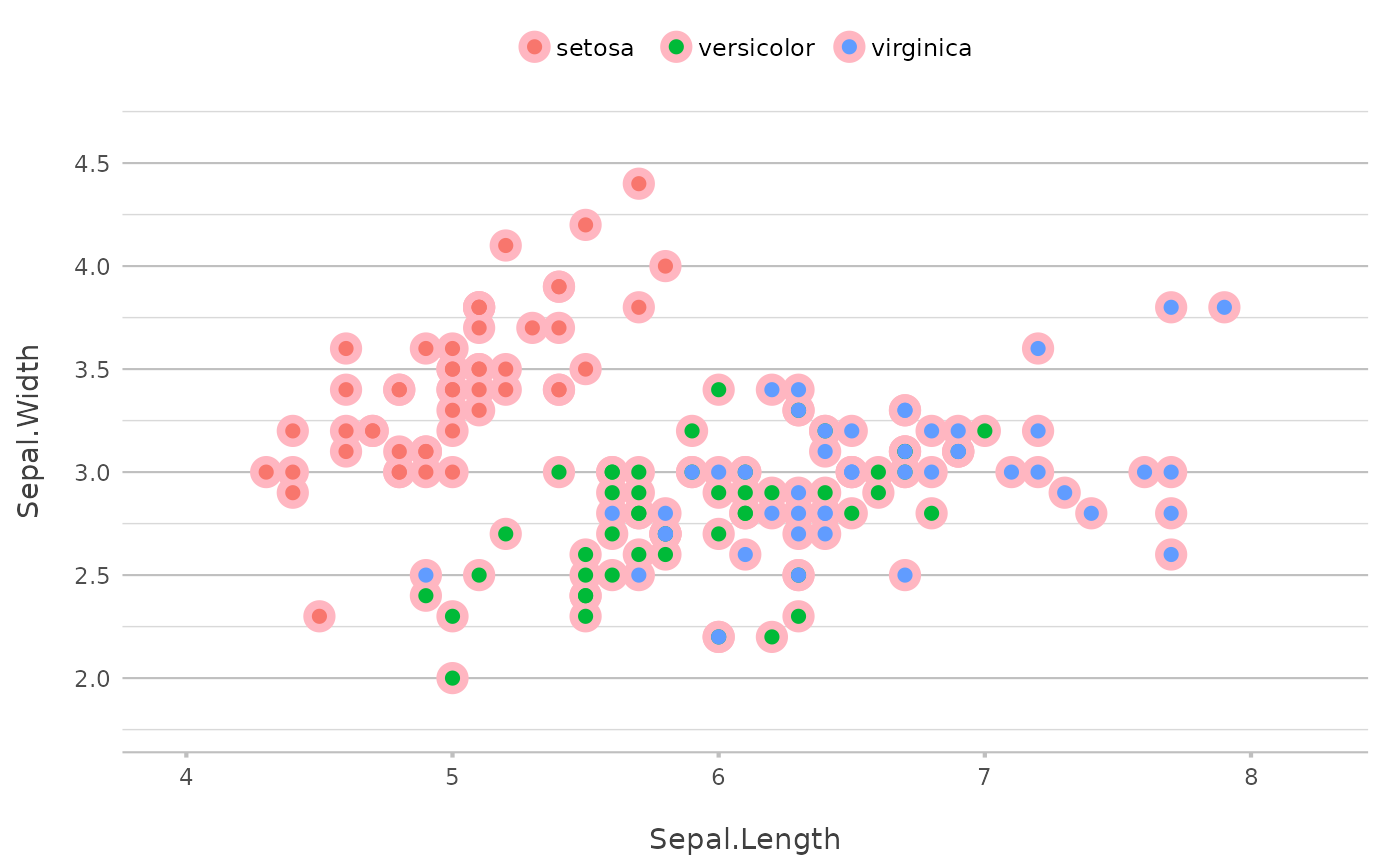
p <- iris |>
plot2(x = Sepal.Length,
y = Sepal.Width,
category = Species,
zoom = TRUE)
#> ℹ Using type = "point" since both axes are numeric
p
 # if not specifying x or y, current plot data are taken
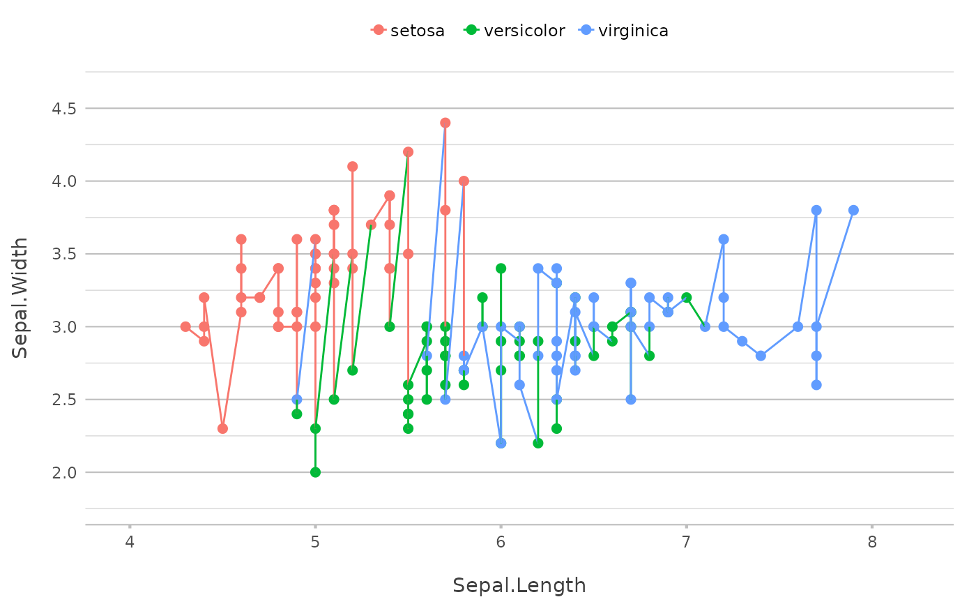
p |> add_line()
# if not specifying x or y, current plot data are taken
p |> add_line()
 p |> add_smooth()
#> `geom_smooth()` using method = 'loess' and formula = 'y ~ x'
p |> add_smooth()
#> `geom_smooth()` using method = 'loess' and formula = 'y ~ x'
 # single values for add_line() will plot 'hline' or 'vline'
# even considering the `category` if set
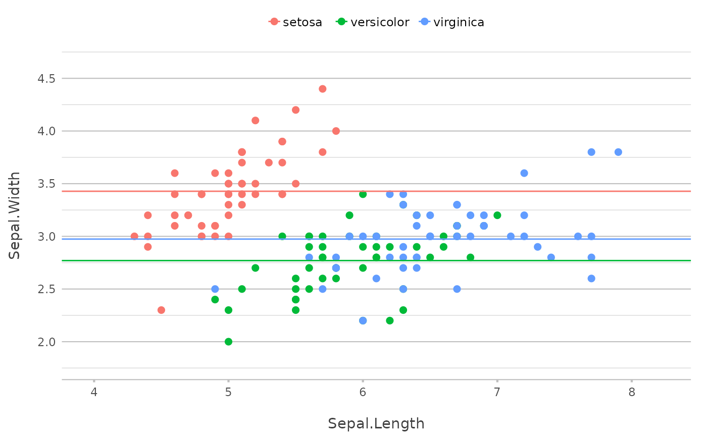
p |>
add_line(y = mean(Sepal.Width))
# single values for add_line() will plot 'hline' or 'vline'
# even considering the `category` if set
p |>
add_line(y = mean(Sepal.Width))
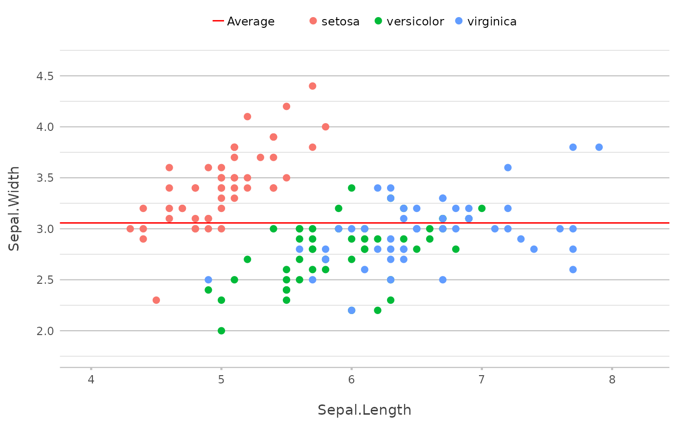 # set `colour` to ignore existing colours
# and use `legend.value` to add a legend
p |>
add_line(y = mean(Sepal.Width),
colour = "red",
legend.value = "Average")
# set `colour` to ignore existing colours
# and use `legend.value` to add a legend
p |>
add_line(y = mean(Sepal.Width),
colour = "red",
legend.value = "Average")
 # also works with facets
iris |>
plot2(x = Sepal.Length,
y = Sepal.Width,
facet = Species) |>
add_line(y = mean(Sepal.Width),
legend.value = "Average")
#> ℹ Assuming facet.fixed_x = TRUE since the three x scales differ by less than
#> 25%
#> ℹ Assuming facet.fixed_y = TRUE since the three y scales differ by less than
#> 25%
#> ℹ Assuming facet.repeat_lbls_y = FALSE since y has fixed scales
#> ℹ Using type = "point" since both axes are numeric
# also works with facets
iris |>
plot2(x = Sepal.Length,
y = Sepal.Width,
facet = Species) |>
add_line(y = mean(Sepal.Width),
legend.value = "Average")
#> ℹ Assuming facet.fixed_x = TRUE since the three x scales differ by less than
#> 25%
#> ℹ Assuming facet.fixed_y = TRUE since the three y scales differ by less than
#> 25%
#> ℹ Assuming facet.repeat_lbls_y = FALSE since y has fixed scales
#> ℹ Using type = "point" since both axes are numeric
 iris |>
plot2(x = Sepal.Length,
y = Sepal.Width,
facet = Species) |>
add_line(y = range(Sepal.Width),
legend.value = "Range")
#> ℹ Assuming facet.fixed_x = TRUE since the three x scales differ by less than
#> 25%
#> ℹ Assuming facet.fixed_y = TRUE since the three y scales differ by less than
#> 25%
#> ℹ Assuming facet.repeat_lbls_y = FALSE since y has fixed scales
#> ℹ Using type = "point" since both axes are numeric
iris |>
plot2(x = Sepal.Length,
y = Sepal.Width,
facet = Species) |>
add_line(y = range(Sepal.Width),
legend.value = "Range")
#> ℹ Assuming facet.fixed_x = TRUE since the three x scales differ by less than
#> 25%
#> ℹ Assuming facet.fixed_y = TRUE since the three y scales differ by less than
#> 25%
#> ℹ Assuming facet.repeat_lbls_y = FALSE since y has fixed scales
#> ℹ Using type = "point" since both axes are numeric
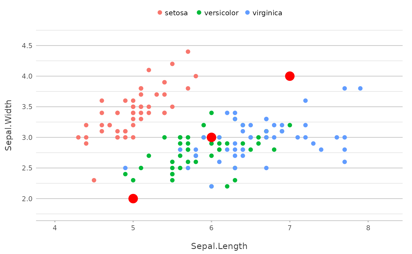
 p |>
add_line(x = mean(Sepal.Length)) |>
add_line(y = mean(Sepal.Width))
p |>
add_line(x = mean(Sepal.Length)) |>
add_line(y = mean(Sepal.Width))
 p |>
add_point(x = median(Sepal.Length),
y = median(Sepal.Width),
shape = 13,
size = 25,
show.legend = FALSE)
p |>
add_point(x = median(Sepal.Length),
y = median(Sepal.Width),
shape = 13,
size = 25,
show.legend = FALSE)
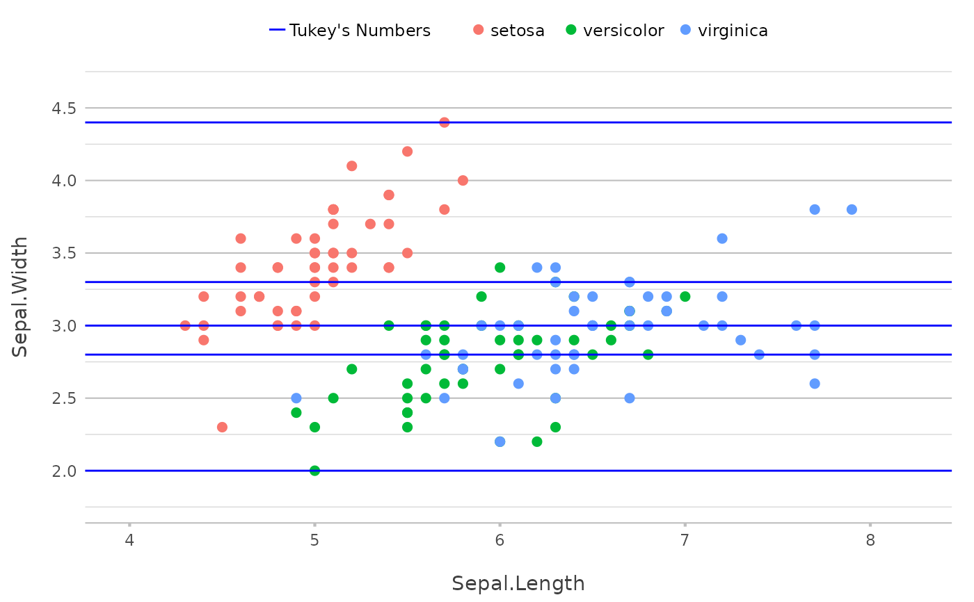
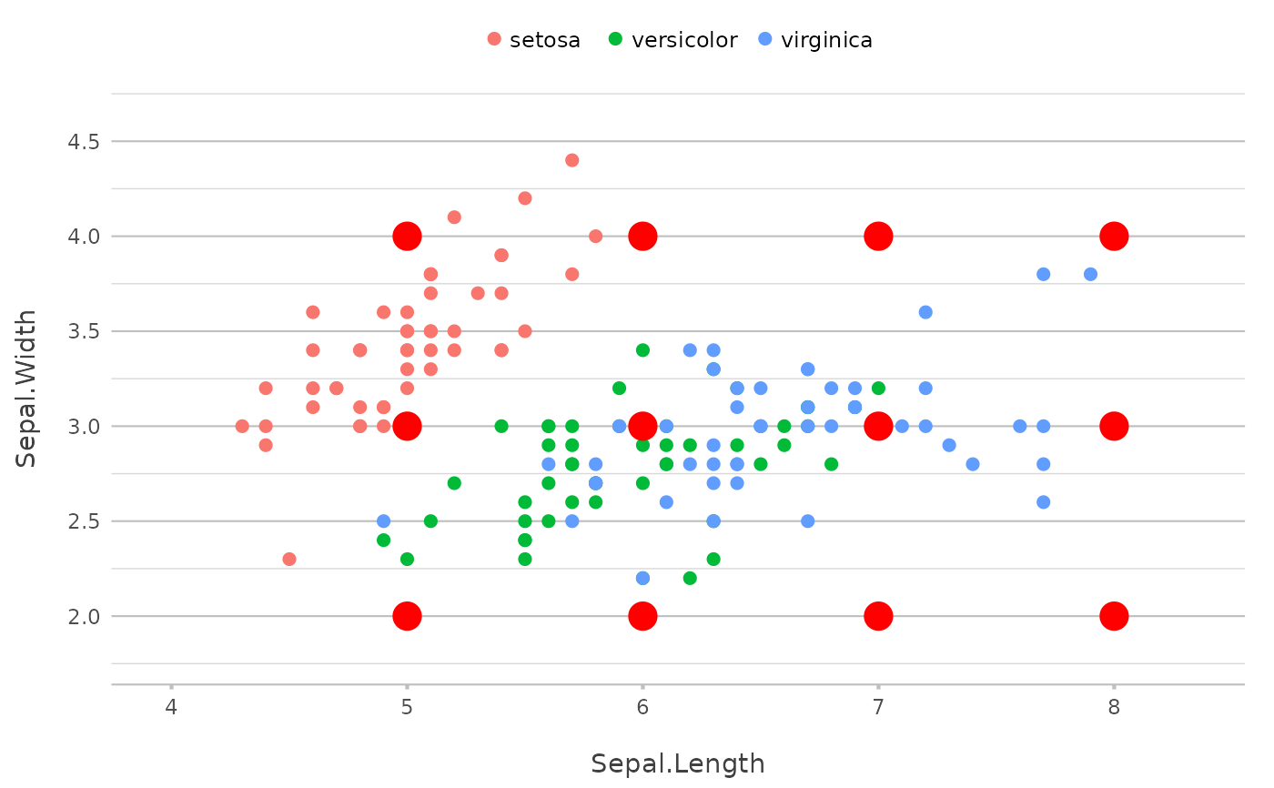
 # multiple values will just plot multiple lines
p |>
add_line(y = fivenum(Sepal.Width),
colour = "blue",
legend.value = "Tukey's Numbers")
# multiple values will just plot multiple lines
p |>
add_line(y = fivenum(Sepal.Width),
colour = "blue",
legend.value = "Tukey's Numbers")
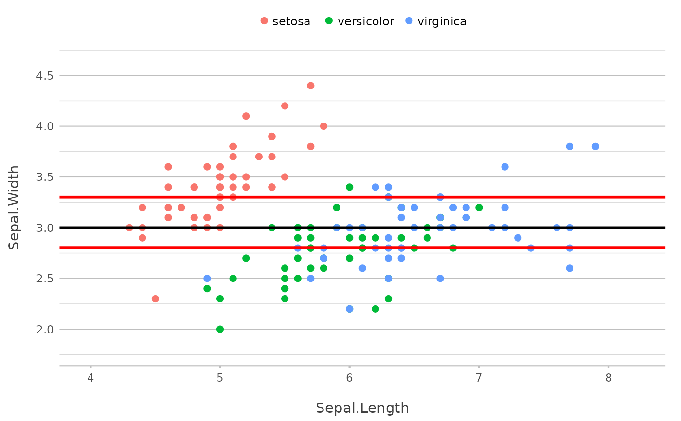
 p |>
add_line(y = quantile(Sepal.Width, c(0.25, 0.5, 0.75)),
colour = c("red", "black", "red"),
linewidth = 1)
p |>
add_line(y = quantile(Sepal.Width, c(0.25, 0.5, 0.75)),
colour = c("red", "black", "red"),
linewidth = 1)
 # use move to move the new layer down
p |>
add_point(size = 5,
colour = "lightgrey",
move = -1)
# use move to move the new layer down
p |>
add_point(size = 5,
colour = "lightgrey",
move = -1)
 # providing x and y will just plot the points as new data,
p |>
add_point(y = 2:4,
x = 5:7,
colour = "red",
size = 5)
# providing x and y will just plot the points as new data,
p |>
add_point(y = 2:4,
x = 5:7,
colour = "red",
size = 5)
 # even with expanded grid if x and y are not of the same length
p |>
add_point(y = 2:4,
x = 5:8,
colour = "red",
size = 5)
# even with expanded grid if x and y are not of the same length
p |>
add_point(y = 2:4,
x = 5:8,
colour = "red",
size = 5)
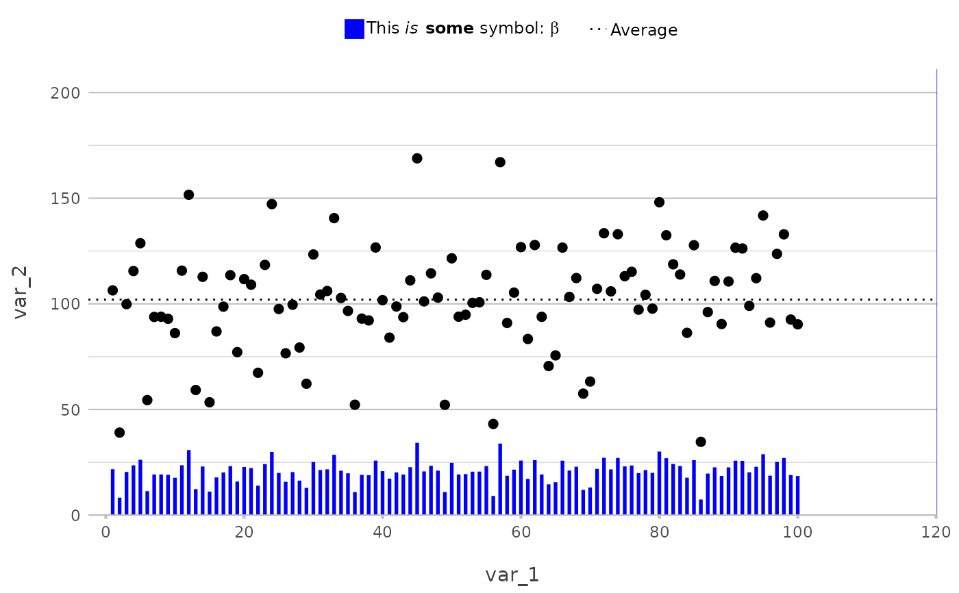
 # any mathematical transformation of current values is supported
df <- data.frame(var_1 = c(1:100),
var_2 = rnorm(100, 100, 25),
var_3 = rep(LETTERS[1:5], 5))
df |>
plot2(var_1, var_2) |>
add_line(y = mean(var_2),
linetype = 3,
legend.value = "Average") |>
add_col(y = var_2 / 5,
width = 0.25,
colour = "blue",
legend.value = "This *is* **some** symbol: $beta$")
#> ℹ Using type = "point" since both axes are numeric
#> Warning: Removed 1 row containing missing values or values outside the scale range
#> (`geom_col()`).
# any mathematical transformation of current values is supported
df <- data.frame(var_1 = c(1:100),
var_2 = rnorm(100, 100, 25),
var_3 = rep(LETTERS[1:5], 5))
df |>
plot2(var_1, var_2) |>
add_line(y = mean(var_2),
linetype = 3,
legend.value = "Average") |>
add_col(y = var_2 / 5,
width = 0.25,
colour = "blue",
legend.value = "This *is* **some** symbol: $beta$")
#> ℹ Using type = "point" since both axes are numeric
#> Warning: Removed 1 row containing missing values or values outside the scale range
#> (`geom_col()`).
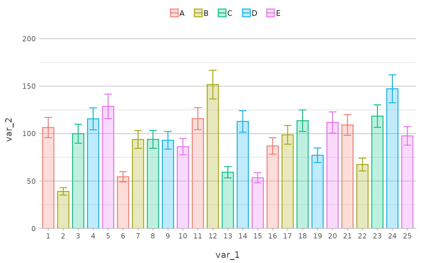
 # plotting error bars was never easier
library("dplyr", warn.conflicts = FALSE)
df2 <- df |>
as_tibble() |>
slice(1:25) |>
filter(var_1 <= 50) |>
mutate(error1 = var_2 * 0.9,
error2 = var_2 * 1.1)
df2
#> # A tibble: 25 × 5
#> var_1 var_2 var_3 error1 error2
#> <int> <dbl> <chr> <dbl> <dbl>
#> 1 1 39.1 A 35.2 43.0
#> 2 2 99.9 B 89.9 110.
#> 3 3 116. C 104. 127.
#> 4 4 129. D 116. 142.
#> 5 5 54.5 E 49.0 59.9
#> 6 6 93.8 A 84.4 103.
#> 7 7 93.9 B 84.5 103.
#> 8 8 92.9 C 83.6 102.
#> 9 9 86.2 D 77.5 94.8
#> 10 10 116. E 104. 127.
#> # ℹ 15 more rows
df2 |>
plot2(var_1, var_2, var_3, type = "col", datalabels = FALSE, alpha = 0.25, width = 0.75) |>
# adding error bars was never easier - just reference the lower and upper values
add_errorbar(error1, error2)
#> ℹ This additional argument was given to the geom: alpha
#> ℹ Using x.character = TRUE for discrete plot type (geom_col) since var_1 is
#> numeric
# plotting error bars was never easier
library("dplyr", warn.conflicts = FALSE)
df2 <- df |>
as_tibble() |>
slice(1:25) |>
filter(var_1 <= 50) |>
mutate(error1 = var_2 * 0.9,
error2 = var_2 * 1.1)
df2
#> # A tibble: 25 × 5
#> var_1 var_2 var_3 error1 error2
#> <int> <dbl> <chr> <dbl> <dbl>
#> 1 1 39.1 A 35.2 43.0
#> 2 2 99.9 B 89.9 110.
#> 3 3 116. C 104. 127.
#> 4 4 129. D 116. 142.
#> 5 5 54.5 E 49.0 59.9
#> 6 6 93.8 A 84.4 103.
#> 7 7 93.9 B 84.5 103.
#> 8 8 92.9 C 83.6 102.
#> 9 9 86.2 D 77.5 94.8
#> 10 10 116. E 104. 127.
#> # ℹ 15 more rows
df2 |>
plot2(var_1, var_2, var_3, type = "col", datalabels = FALSE, alpha = 0.25, width = 0.75) |>
# adding error bars was never easier - just reference the lower and upper values
add_errorbar(error1, error2)
#> ℹ This additional argument was given to the geom: alpha
#> ℹ Using x.character = TRUE for discrete plot type (geom_col) since var_1 is
#> numeric
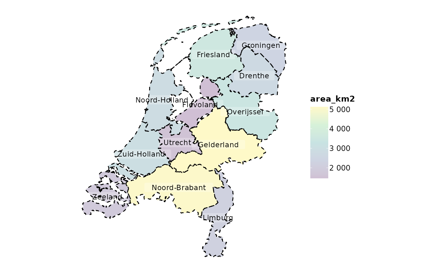
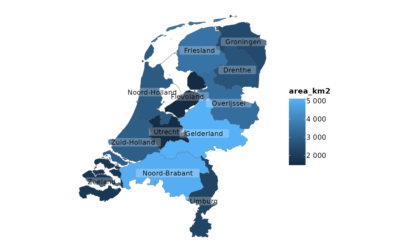
 # adding sf objects is just as convenient as all else
netherlands |>
plot2()
#> ℹ Assuming datalabels.centroid = TRUE. Set to FALSE for a point-on-surface
#> placing of datalabels.
#> ℹ Using category = area_km2
#> ℹ Using datalabels = province
# adding sf objects is just as convenient as all else
netherlands |>
plot2()
#> ℹ Assuming datalabels.centroid = TRUE. Set to FALSE for a point-on-surface
#> placing of datalabels.
#> ℹ Using category = area_km2
#> ℹ Using datalabels = province
 netherlands |>
plot2(colour_fill = "viridis", colour_opacity = 0.75)
#> ℹ Assuming datalabels.centroid = TRUE. Set to FALSE for a point-on-surface
#> placing of datalabels.
#> ℹ Using category = area_km2
#> ℹ Using datalabels = province
netherlands |>
plot2(colour_fill = "viridis", colour_opacity = 0.75)
#> ℹ Assuming datalabels.centroid = TRUE. Set to FALSE for a point-on-surface
#> placing of datalabels.
#> ℹ Using category = area_km2
#> ℹ Using datalabels = province
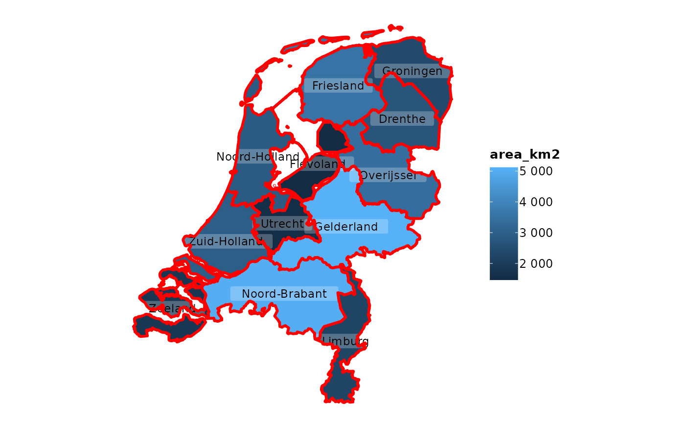 netherlands |>
plot2(colour_fill = "viridis", colour_opacity = 0.75) |>
# add the same sf object, but now with empty fill and other options
add_sf(netherlands,
colour = "black",
colour_fill = NA,
linetype = 2,
linewidth = 0.5)
#> ℹ Assuming datalabels.centroid = TRUE. Set to FALSE for a point-on-surface
#> placing of datalabels.
#> ℹ Using category = area_km2
#> ℹ Using datalabels = province
netherlands |>
plot2(colour_fill = "viridis", colour_opacity = 0.75) |>
# add the same sf object, but now with empty fill and other options
add_sf(netherlands,
colour = "black",
colour_fill = NA,
linetype = 2,
linewidth = 0.5)
#> ℹ Assuming datalabels.centroid = TRUE. Set to FALSE for a point-on-surface
#> placing of datalabels.
#> ℹ Using category = area_km2
#> ℹ Using datalabels = province